
Developers often override or customize default Bootstrap CSS styles when working on web development projects. Most developers do it to make changes to Bootstrap fonts, borders, colors, or other bootstrap dashboard styles. In addition, default Bootstrap CSS styles are also customized to extend Bootstrap classes with new custom classes and to change Bootstrap grid layouts.
There are two easy and effective ways through which you can customize Bootstrap. Using CSS is the simplest and robust way to do so whereas using SASS for Bootstrap customization is actually an advanced method. Here you can find a step by step guide on how to customize Bootstrap with both of the above-mentioned methods.
Using CSS Override
CSS Customizations should be added to a separate custom.css file to ensure maintainability. This will guarantee that the original Bootstrap style files will remain unaltered.
You need to remember that order matters in CSS. So, the final definition of a particular CSS rule will override the previously defined rules when the CSS selectors & properties match. This is exactly why the custom.css reference should follow after Bootstrap.css.
<link rel="stylesheet" type="text/css" href="bootstrap.min.css">
<link rel="stylesheet" type="text/css" href="custom.css">
Example
Bootstrap card component comes with a border by default. In this example, we will be removing the border and including a box-shadow to the Bootstrap card component by using custom.css. Here’s the code to do that.
The following image shows a default bootstrap card. 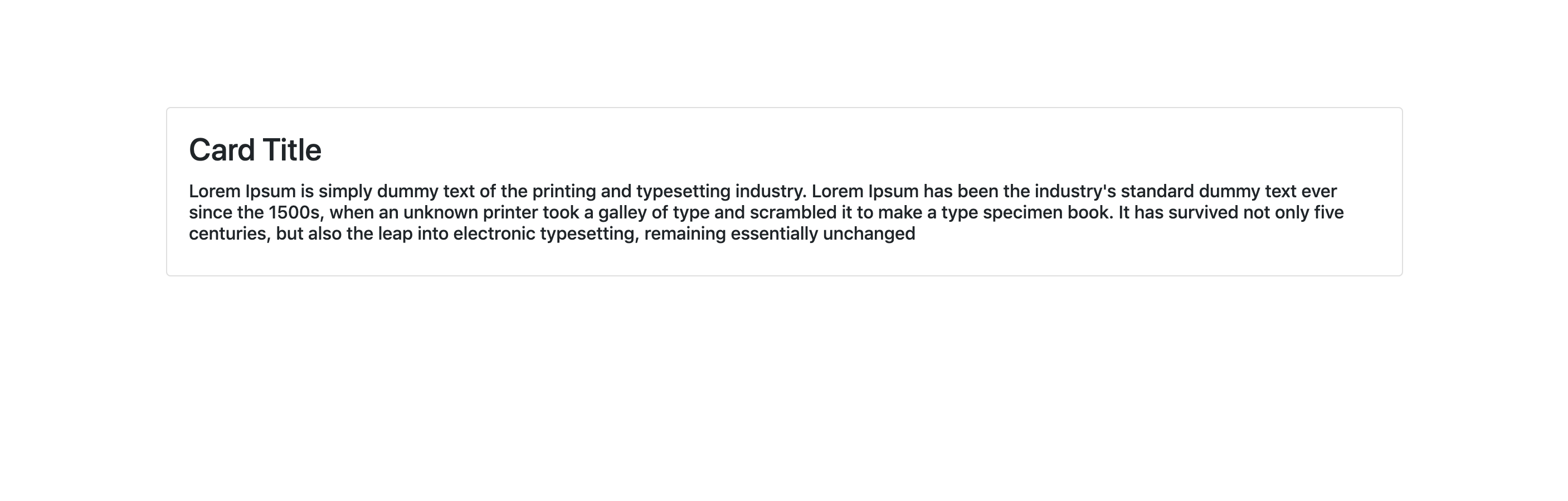
Add the following lines of code in the custom.css file.
/* removes border from card and adds box-shadow property */
 .card {
         border: none;
         box-shadow: 0 1px 20px 0 rgba(0,0,0,.1);
       }
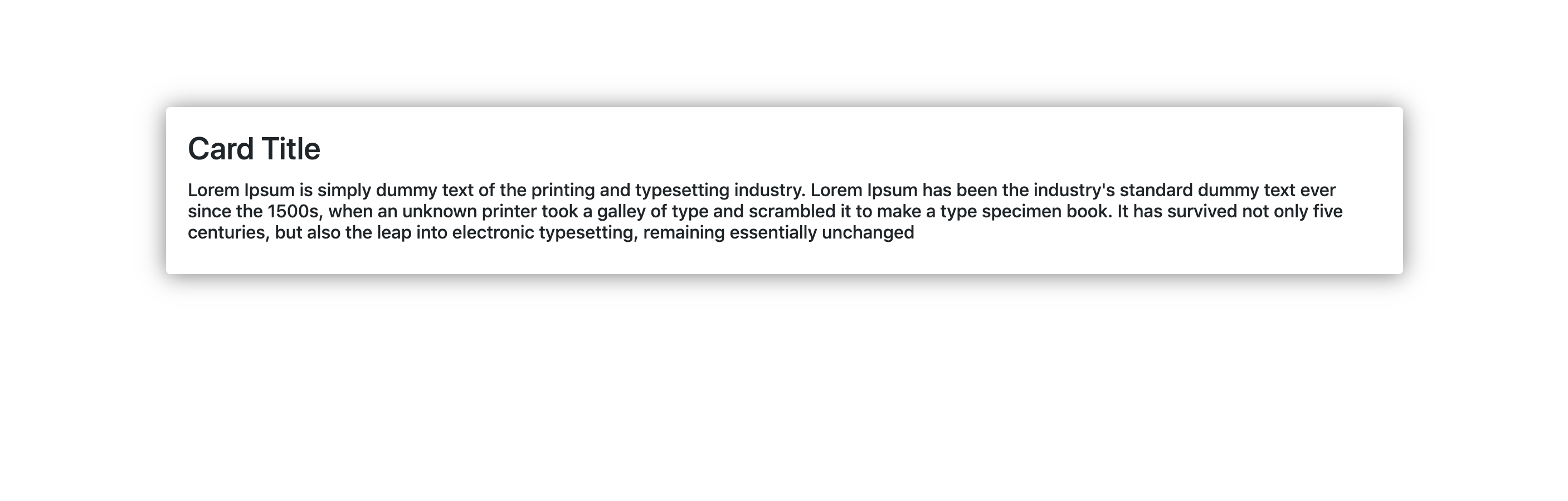
Here is an image of the resultant customized Bootstrap Card component
 CSS Specificity
Another important point to keep in mind when overriding the bootstrap styles is CSS specificity. We will need to use selectors that are as specific as the ones in the bootstrap.css. Using selectors that are not specific will not give you desired results, as the component will end up taking the default bootstrap styles even though we have written the custom styles in custom.css file.
It is best to use CSS overrides for simple Bootstrap customizations, but we recommend you to try the SASS method when it comes to making extensive customizations.
Using SASS
SASS is the most recommended method to customize Bootstrap. This is mainly because SASS language is used to write the entire Bootstrap 4 CSS source.
A Project Structure will look like this.
your-project/
├── scss
│   └── custom.scss
└── node_modules/
    └── bootstrap/
    └── scss/
         └── mixins/
         └── utilities/
         └── _functions.scss
         └── _mixins.scss
         └── _variables.scss
         └── (...more bootstrap scss source files)
         └── bootstrap-grid.scss
         └── bootstrap-reboot.scss
         └── bootstrap.scss
In the Bootstrap SASS source file, you can find a Bootstrap.scss file that contains Bootstrap SASS files. There is also a variables.scss file, which contains all the SASS variables. You can use your custom.scss files to override these variables.
Bonus Read: Check out our entire range of bootstrap admin templates here.
Example
The first thing most developers do is to make adjustments to the color palette when customizing default Bootstrap styles. You will need to use $theme-colors SASS map to change the default colors. Here’s how you can change the colors in default Bootstrap theme-colors.
Import the bootstrap variables and functions into the custom.scss file. Now, add the code to change bootstrap default theme-colors and then add the bootstrap scss. The entire code in custom.scss is given below.
/* === Import Bootstrap functions and variables === */
@import "bootstrap/scss/functions";
@import "bootstrap/scss/variables";
/*-------------------------------------------------------------------*/
/* Change theme-colors */
$theme-colors: (
                primary: #234d7b,
                secondary: #3b3c3e,
                success: #1e6111,
                info:  #64c3d2,
                warning: #f5e74a,
                danger: #820410
                );

/*-------------------------------------------------------------------*/
/* === Boostrap Main SCSS === */
@import "bootstrap/scss/bootstrap";
/*-------------------------------------------------------------------*/>
A default Bootstrap Button will look like this.

The button will look like this when it is customized by using the above-mentioned code.

New to Bootstrap? Check out our free tutorial on Bootstrap 4! If you’re interested in getting a Bootstrap admin template, we make the best! Check our website out.