Bootstrap has grown to be one of the most popular frameworks when working on building powerful and complex web applications. However, one of the major downfalls of the open-source Bootstrap framework is that it heavily relies on jQuery. In addition, an extensive number of bootstrap dashboard components that include Modals and Alerts are also dependent on jQuery.
So, the tricky part is that you will need to find a way to avoid jQuery dependency before integrating Bootstrap with Vue. The simplest and best way through which you can do that is to use BootstrapVue in your project. BootstrapVue makes it possible for Vue developers to use Bootstrap in their projects without worrying about Bootstrap’s heavy dependency on jQuery.
Getting Started
There are multiple methods that can be used to generate a vue project. The best and most commonly used method is the Vue CLI method, which is why we will be putting more focus on this particular method.
Vue-CLI Method
The initial step is to install Vue CLI in your device. The command that you must use to install Vue CLI on your system is given below.
$ npm i @vue/cli
Once you have done that, create a new project with the following command.
$ vue create project-name
Now, open the newly created project and serve it by using the following command.
$ npm run serve
Your Project will now be automatically running in your internet browser.
Installing Bootstrap Vue
As we mentioned earlier, we will be using BootstrapVue in this project. Here is the command you will need to install Bootstrap Vue in your project.
$ npm i bootstrap-vue
You must also have to install Bootstrap to ensure BootstrapVue is working perfectly .The command to install Bootstrap is given below.
$ npm i bootstrap
Now, you have already installed both BootstrapVue and Bootstrap in your project.
Registering Bootstrap Vue to the Project
Locate the main.js file from the project and add the following code to the file to initialise BootstrapVue in the project.
import BootstrapVue from 'bootstrap-vue'
import 'bootstrap/dist/css/bootstrap.css'
import 'bootstrap-vue/dist/bootstrap-vue.css'
Vue.use(BootstrapVue)
Now, you can use everything available in BootstrapVue in your project without any issues.
How to Use BootstrapVue Components
Once you have finished integrating BootstrapVue, you can use all Bootstrap components like Buttons, Badges, Tooltips, and more to your project. Here is an example on how you can work with common Bootstrap components.
Buttons
The custom button styles of Bootstrap can be used for actions in dialogs, forms, and more.
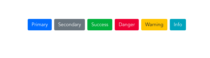
The code you will need to run to create such a design is listed below.
<b-button variant="primary">Primary</b-button>
<b-button variant="secondary">Secondary</b-button>
<b-button variant="success">Success</b-button>
<b-button variant="danger">Danger</b-button>
<b-button variant="warning">Warning</b-button>
<b-button variant="info">Info</b-button>
Badges
Bootstrap Badges help users display information next to an element or category.

You must run the following code to create the above-mentioned design.
<b-badge variant="primary">Primary</b-badge>
<b-badge variant="secondary">Secondary</b-badge>
<b-badge variant="success">Success</b-badge>
<b-badge variant="danger">Danger</b-badge>
<b-badge variant="warning">Warning</b-badge>
<b-badge variant="info">Info</b-badge>
Tabs
Tabs makes it easier for users to manage content, thereby offering a fine user experience.
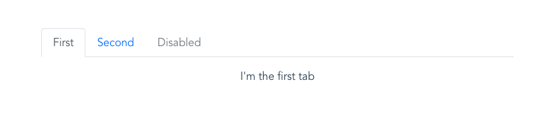
The code required to create Bootstrap Tabs just as in the above-example is given below.
<b-tabs>
   <b-tab title="First" active>
      <p>First tab</p>
   </b-tab>
   <b-tab title="Second">
      <p>Second tab</p>
   </b-tab>
   <b-tab title="Disabled" disabled>
      <p>Disabled tab!</p>
   </b-tab>
</b-tabs>
Modal
Bootstrap Modals can be used for user notifications, UI enhancements, lightboxes, and more.
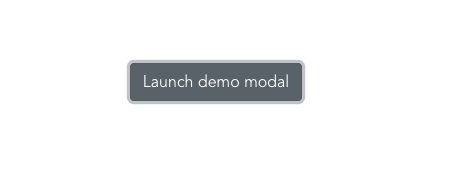
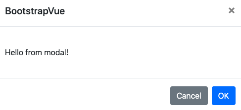
The code you need to create such a Bootstrap Modal can be found below.
<b-button v-b-modal.modal-1>Launch demo modal</b-button>
<b-modal id="modal-1" title="BootstrapVue">
   <p class="my-4">Hello from modal!</p>
</b-modal>
Using multiple Bootstrap components in a single project is also very easy. Here is a sample page we have created using three different Bootstrap components : Bootstrap Tables, Bootstrap Navbars, and Bootstrap Cards.
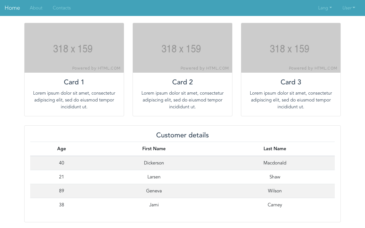
The code to create such a sample page is given below.
<div>
   <b-navbar toggleable="lg" type="dark" variant="info">
      <b-navbar-brand href="#">Home</b-navbar-brand>
      <b-navbar-toggle target="nav-collapse"></b-navbar-toggle>
      <b-collapse id="nav-collapse" is-nav>
         <b-navbar-nav>
            <b-nav-item href="#">About</b-nav-item>
            <b-nav-item href="#" disabled>Contacts</b-nav-item>
         </b-navbar-nav>
         <!-- Right aligned nav items -->
         <b-navbar-nav class="ml-auto">
            <b-nav-item-dropdown text="Lang" right>
               <b-dropdown-item href="#">EN</b-dropdown-item>
               <b-dropdown-item href="#">ES</b-dropdown-item>
               <b-dropdown-item href="#">RU</b-dropdown-item>
               <b-dropdown-item href="#">FA</b-dropdown-item>
            </b-nav-item-dropdown>
            <b-nav-item-dropdown right>
               <!-- Using 'button-content' slot -->
               <template v-slot:button-content>
                  <em>User</em>
               </template>
               <b-dropdown-item href="#">Profile</b-dropdown-item>
               <b-dropdown-item href="#">Sign Out</b-dropdown-item>
            </b-nav-item-dropdown>
         </b-navbar-nav>
      </b-collapse>
   </b-navbar>
   <b-container>
      <b-row class="mt-4">
         <b-col cols="4">
            <b-card
               title="Card 1"
               img-src="https://via.placeholder.com/318x159"
                img-alt="Image"
               img-top
               tag="article"
               class="mb-2"
               >
               <b-card-text>
                  Lorem ipsum dolor sit amet, consectetur adipiscing elit, sed do eiusmod tempor incididunt ut.
               </b-card-text>
            </b-card>
         </b-col>
         <b-col cols="4">
            <b-card
               title="Card 2"
               img-src="https://via.placeholder.com/318x159"
               img-alt="Image"
               img-top
               tag="article"
               class="mb-2"
               >
               <b-card-text>
                  Lorem ipsum dolor sit amet, consectetur adipiscing elit, sed do eiusmod tempor incididunt ut.
               </b-card-text>
            </b-card>
         </b-col>
         <b-col cols="4">
            <b-card
               title="Card 3"
               img-src="https://via.placeholder.com/318x159"
               img-alt="Image"
               img-top
               tag="article"
               class="mb-2"
               >
               <b-card-text>
                  Lorem ipsum dolor sit amet, consectetur adipiscing elit, sed do eiusmod tempor incididunt ut.
               </b-card-text>
            </b-card>
         </b-col>
         <b-col cols="12">
            <b-card
               class="mt-4"
               >
               <h4>Customer details</h4>
               <b-table striped hover :items="items"></b-table>
            </b-card>
         </b-col>
      </b-row>
   </b-container>
</div>
Comments(1)
sathish
August 23, 2020
good