
The purpose of a dashboard is to give a visual display of information that a person would need in order to help the decision-making. A physical example for this would be the dashboard of a car. It displays the essential information to the driver like the amount of fuel left in the tank, the speed of the car, the distance traveled, rpm and temperature of your engine. These pieces of information are the ones that are required by the driver and presented in a way that helps to make decisions quickly like whether he can continue to go on or if he needs a fuel refill..
Dashboards are an inseparable part of a website as well. In a business perspective, the idea of a dashboard is to give clear insights of a business so that the information is useful and helpful in the process of decision-making. Rather than overloading with data and creating hardship in the decision-making process which is not ideal for the smooth functioning and growth of the business.
A powerful dashboard should be carefully designed to convey the information with the right use of data visualization techniques. Proper types of charts should be used to represent the data and the right type of data should be presented keeping the audience in mind.
There are a lot of things that are required to create an effective dashboard. Let’s take a look at some of the things that you need to keep in mind before and during building a dashboard.
Know the audience
Before starting with the dashboard, the first thing to know is who the target audience is. What is the information that they need? This helps to list all and only the necessary data that needs to be displayed and structure in a way that they provide a meaningful information that is fit for their needs and ability.
Also, understand the capability of the audiences – their expertise, area of interest, ability to understand the data presented to them, and the time they would normally spend on analyzing the data. This will help to decide the level of details that should be incorporated into the dashboard without unnecessarily complicating the data. Thus matching the user’s comfort and convenience.
Say, for example, a site manager may only require the number of visits that the site has and if it has increased or decreased. At the same time, the SEO of the website would want to know more details about where the traffic is coming from.
However, most of the time you will have multiple audiences. In such situations, serving all of their needs will take careful prioritization of the data that are to be displayed.
Understand the right type of dashboard
After determining what type of audience you are serving, and what kind of metrics are to be displayed this part comes pretty easy. Knowing the requirements helps determine the right type of dashboard that will serve the purpose. There are three types of dashboards:
Operational dashboard
This type of dashboard is used for providing real-time data or data that change quite frequently to track the current performance of the key metrics.
Strategic dashboards
Strategic dashboards are not updated as frequently as the operational dashboard and are viewed to check the status of the key performance indicators by executives.
Analytical dashboards
Analytical dashboards are used to analyze a huge amount of data to find patterns and trends, predict outcomes and gain more insight of the data.
Analyzing the audience and their requirement gives a concept of what kind of dashboard is required.
Determine what all are the key performance indicators (KPI) and the most relevant information needed by the user that will help the user monitor and keep track of the performance and make decisions accordingly. Knowing the key performance indicators will help determine what all data are important to the user and which data should be displayed and how it should be displayed.
What are the Metrics to be Displayed
The metrics to be displayed depend entirely on the audience. Their level of expertise and area of interest. Know the key performance indicators or KPI of the dashboard.
Make sure that the dashboard is not filled with the metrics that make the user struggle to get anything out of the data. The dashboard must not be cluttered with data that may not be relevant. The number of metrics should be limited and only those must be displayed that are absolutely necessary for the user to monitor and keep track of.
Keep It Simple
Make it a point to keep the dashboard simple. The number of metrics should not exceed 7 in the best case.
Another thing to keep in mind is to keep the dashboard on a page. The idea of a dashboard is to manage the information in a visual way that facilitates information gathering easy. With the dashboard spanning more than a page, it becomes like a report.
The next thing would be to minimize the text as much as possible. Humans are visual animals. Most of the information we receive is visual information. We are evolved to comprehend data more effectively through visual means.
A dashboard is a visual tool for information gathering and data analysis. The user must get an idea of the current status of performance metric by taking a look at the dashboard. Having to read about the current statuses does not make up a good user experience when it comes to monitoring and keeping track.
Consider the example of the dashboard of a car. Imagine if the driver had to read small sentences to know if the fuel tank was empty or if the engine was heating up. That is really inconvenient.
Give Insights, Not Just Data
When visualizing some data, the point is not just to give the data in an easily understandable way but also to give insights of the data to the user. The trends and patterns that the data has that would have been impossible to detect when presented in a spreadsheet. Tell the story that the data is trying to tell that the user would never understand otherwise.
Also, never give a piece of information alone. Give a context to the data. For example, when the user is given the data of daily sales, he should be able to know the history and the future, as in what the earlier sales have been and what is the target to be achieved.
Another way of adding context to the data is the use of colors. A metric can be colored to indicate if the value of that metric is below the threshold or to indicate a priority status so that the user can take appropriate measures.
Use the Right Visualization Tools
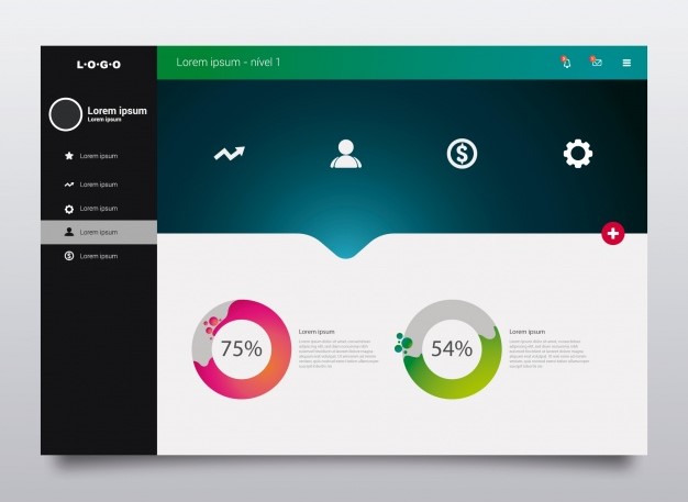
Identify the nature of the data and determine what kind of data representation technique will tell the story. Some data are better represented using bar chart and some other using a donut chart. The key is to know beforehand what the data is and which technique can be used to better represent them.
The important thing to keep in mind in charts and graphs is that they should be properly labeled. The user should not have to think what is the data that is represented by the graphs. If possible leave small notes that provide meaningful information to the user.
Do you feel there is more to the list and we missed something? Let us know in the comment section below.