It was necessary to establish a connection between digital interfaces and real-world components during the transition from analog to digital. This was done to ease the mind of users and to make them feel okay with the change.
You may probably be aware that the buttons on most app UIs were designed exactly like a real button. This innovative and creative technique is called as Skeuomorphism.
When digital gadgets were initially introduced, the idea of Skeuomorphism eased things and helped users to move with the flow. However, such designs started to look less attractive with each passing year. As a result, they were replaced with Flat Design just a while after.
Check out our shortlist of best material admin templates available on the interwebs.
Flat Design
The introduction of Flat Design presented a unique opportunity for designers and allowed them to put more focus on UI interface’ usability. This instantly became a major hit, as it made the entire design look stunning along with improving the usability. The flat design did not use any shadows or detailing.
Advantages
- Eliminated unnecessary screen elements
- Fast loading web pages
- Minimal and simple
- Responsive
Disadvantages
- Fewer design options
- Flat design is incapable of making products look interactive
- Make websites look outdated
Material Design
The open-source design system launched by Google is Material Design. The primary goal of introducing Material Design was to bring some sort of the good-old Skeuomorphism back into the design interfaces. It is safe to assume that Material Design has achieved it to a certain extent. Material Design also used both Gradients and Shadows.
Pros
- Brings realism back into the design
- Easy to achieve Motion Design
- Google has listed a set of principles and guidelines for Material Design
Cons
- Relatively more design options
- A bit more resource heavy when compared to Flat Design
Why Was Material Design Launched
Another major reason why Google introduced Material Design was to improve usability and to make people familiar with new web and digital interfaces. One of the major issues with Flat Design was it failed to indicate which items were clickable and not. However, people who were familiar with Skeuomorphism designs knew exactly where to click.
Another excellent aspect of Material Design is that it was capable of mimicking exact real-world conditions to a certain extent. This, in turn, enabled users to understand the purpose and function of different components.
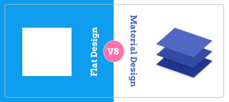
Striking Differences Between Flat Design and Material Design
One of the obvious differences between Material and flat design is that the former one has some kind of three-dimensional properties. However, skeuomorphic or three-dimensional properties are absent when it comes to flat design.
Likewise, the Material design relies on shadows and gradients to add a bit of depth to the design, but that isn’t the case with flat design. Viewers will be able to get a clear idea of what is happening in Material Design, as it gives visual cues and uses animation. If we are talking about page load speed, the flat design has a slighter edge over Material Design.
Material Design has a set of clear guidelines and it is documented exceptionally well by the search engine giant, Google. The latest changes and modifications are also regularly updated. These guidelines clearly explain how to use Material design, which will surely come handy for designers.
The Final Verdict
It is pretty clear that both Material and flat design systems have their own share of merits and issues. It is hard to pick the best one among these design systems. It is best to select a design system based on your project requirements and scope. So, let us know which one of these design systems you are going to use.