Every year, we come across new trends; some of the existing trends are carried forward, and amid all these, there are also those technologies and ideas that have been forgotten forever.
Designers are always open to embracing change. This means that you are always keeping a tab on what is moving and what is not in web design. Also, it is important to analyze and understand the logic of how they approach a particular business provider because it will help you understand better what your end users are expecting and create a design that will offer a great user experience. When you apply logic to your research on your users and the trends they prefer, it will help you to create designs that are user-centric.
Of course, you know what are web design trends, but it is important to know which of these are all set to change the face of the web. This will help you to save time and effort on technologies
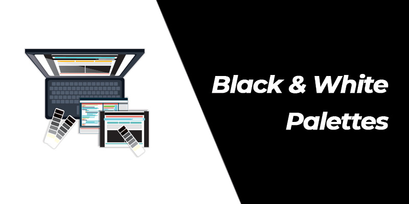
Black-and-white palettes
One of the most important aspects of any website design is its color. It has a great role in nurturing and lifting a person’s mood. Each color that is used on a website has a purpose and intent behind it. Color has a vital role in mapping a brand’s identity to the user’s mind. So let us forget all that because experts foresee a change in this existing paradigm of the web driven by colors.
Let us get ready to be accustomed to the bold black and white shades, which are all set to create a striking difference in the year.
Black indicates strength and assertiveness, while white signifies composure and purity. Magic happens when these are brought together, creating classy designs that will attract the visitor’s eye.
In fact, the irony here is that there is a minimal requirement for color since there are only two choices: black and white. So if you feel that a mere black and white combination might look a little dull, you can add an accent color to it – this will generate the visitor’s interest in that particular area specifically.
Microinteractions
So what exactly is a mircointeraction?
Microinteractions are discrete and individual moments in a product design, which aim to accomplish certain tasks while improving the flow of the product naturally.
These are what bridge user interactions and user experience – whereby a convergence between functionality and design is accomplished.
Some of the examples of how microinteractions can be presented beautifully include the following:
- The screen on the ATM screen, tells the user their transaction is being processed.
- The reactions to a post on Facebook.
- Even, the ‘skip intro’ button on Netflix.
All these are simple examples of how a beautiful mircointeraction can be designed.
This year, make sure that you implement micro interactions if possible in your designs as these indicate details that are smaller, but impact the design and ultimately, the user experience. In fact, these are intended to make a product more enjoyable, comfortable, and engaging.
Moreover, micro-interactions determine whether a user falls in love with a product or they are forced to tolerate it.
These will increase user engagement and make your web pages smarter. Can you offer anything more?
Minimalism
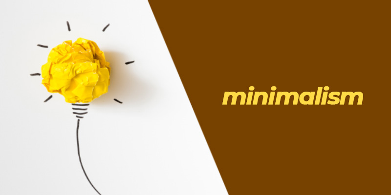
One of the web design trends that has been here for a while and is bound to stay in this year is minimalism. In fact, the purpose behind minimalism is to ensure that users can find what they are looking for without taking too long.
Minimalism can be simply defined as a web design strategy that simplifies interfaces by eliminating unnecessary elements or content that do not support user tasks.
It comes with more whitespace, clear typography (though it might not implement trending fonts), and contrast, removing all kinds of distractions, which would increase user engagement. Some of the advantages of minimalism include faster loading time and easier navigation.
Full-screen videos
The next important trend that we can look forward to this year is the full-screen video.
These videos are considered to be informative and convenient. In fact, the user does not have to put in a lot of effort to scroll from the top of the page to the bottom to check out the information that interests them.
Everything is there as a video. Earlier, several factors pulled designers from including videos in the website designs. Majorly, the load speed was a factor due to the video’s weight. But nowadays, developers are coming up with strategies to include videos without bringing down the load speed of pages.
Cinemagraphs and animations
Many a time, people confuse cinemagraphs with regular gif animation. But both are two different concepts. By definition, cinemagraphs are static images that carry a single dynamic element.
If you haven’t thought about using cinemagraphs, then allow us to walk you through what these are exactly and how these can be beneficial to your business.
Cinemagraphs were first introduced to the world in the year 2011 by the American photographers, Kevin Burg and Jamie Beck with an aim to make their fashion and lifestyle photography more exciting.
However, in the year 2015, cinemagraphs started gaining prominence as bigger brands started utilizing these for their promotional campaigns. You can see it either in video or GIF format over the web, but it is more of a creative and innovative blend of images and video – where certain specific elements in the image can be seen moving.
Now, this peculiar characteristic of movement of elements within the image is one of the reasons why it has become popular in website design – as it helps to hike online engagement. Some of the advantages of cinemagraphs include that these require lesser bandwidth while attracting customer attention within no time.
To be more clear, you can enjoy the benefits of video content within an image. The fineness of movement within a static image arouses user interest and drives engagement.
Along with cinemagraph, it is also important to mention animation. It is a trend that has been used over years and will continue to happen as well.
Thumb-friendly navigation
Mobile is taking over the desktop. Most people are using mobile over desktop devices to browse and to shop, and for most of their internet-related activities.
So it is important to think in terms of mobile whenever a design is being planned. This is where we come to the point of making designs thumb-friendly.
You can refer the book, Designing for Touch, by Josh Clark for further information on how users hold their mobile phones. Even user movements, specifically the thumb movements and how these are processed in the web design process flow have been explained well in this book.
Chatbots
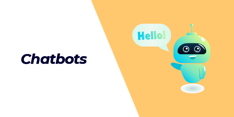
Chatbots have been around us for a while. But experts are expecting these to take over the web slowly starting from this year. Thanks to the developments and advancements in the fields of artificial intelligence (AI) and machine learning, which are enhancing chatbots, making these more intelligent and efficient.
Compared with the past, we can expect new chatbots to show up more and more on web pages. The best part of these chatbots will be the customization. It is expected that designers would use brighter colors for chatbots so that they stand out from the crowd, indicating their prominence on any particular page.
Moreover, the aim is to welcome customer attention and generate interest. Sooner or later, we can expect an inflow of mascots across websites to represent brands and maybe, these bots will have a personable face as well.
Natural and organic shapes
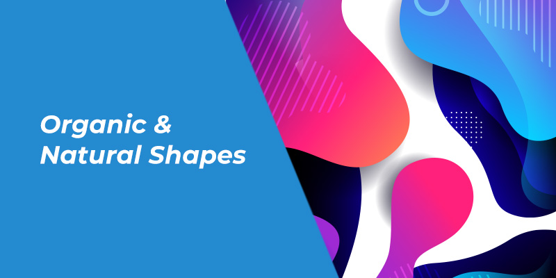
Grids are being used to make the website design process easier. But designers want to keep it natural, so they prefer natural shapes and smooth lines over the grids.
Of course, there is no argument to the fact that the geometric shapes, including squares, triangles, and rectangles give a sharp edge to the design, bringing about stability. But in the year, more than blessing a design with stability, designers are willing to provide accessibility and comfort. These are what the users seek for rather than a stable and monotonous design being repeated throughout.
As organic shapes showcase a great deal of imperfection and asymmetry naturally, their implementation in web designs will make your pages stand out as these attract attention. The major intention is to create a human touch and generate life through the illusion or impression of movement.
Code and design
There has been a myth that designers do not code and developers do not design. It is high time we settled these differences.
In fact, many of us are designers and also good at coding. So this solves the age-old myth that designers do not code. In this year, we can see more designers approaching their design from a programming perspective, which would help with improving the user experience when the final product is delivered.
Some designers have even come up with better tools to help with their design process through their coding knowledge. Figma and Framer X are examples of such design tools.
Content still rules
In this year, we will still see the power and magic of content ruling the world of the web. The flow of this content through the designs will form the crux of the story.
Good content will generate the reader’s interest, but how it is presented will determine whether they want to read it or not.
Make the content flow in your design easier and simpler, people will read and come back, driving the search engine traffic.
Web design is changing
With the launch of smartphones and the rise of social media networks, networking and connectivity have been taken to an entirely different level. In fact, the world is at our fingertips now. We have access to the latest and updated content that interests us from anywhere at any time.
A lot has changed since the day the web was invented. Technology is changing and user perspectives, their needs, demands, and expectations are also changing. We need to work toward fulfilling their needs. Some of these trends, stay while others fade over time. Make wise decisions and smart choices when designing for the web.
It is for the people that you are designing. Keep in mind their needs and expectations when you start – to ensure that the end product would be exactly what they need.
If you think that there are other trends that might make a comeback in this year or there are new trends that might become a hit, then do not hesitate to share it with us.
We would love to hear from you. Leave us a comment in the comment box below.