A number of frameworks that include Bootstrap and Angular are widely used for front-end development. These frameworks offer a comfortable developing environment which makes it easier to build complex and powerful web applications. Angular is generally used when developing single-page applications while Bootstrap can be used for a wide variety of applications.
Integrating bootstrap dashboards with Angular offers an unlimited number of possibilities when working on web app development projects. But, we cannot integrate native Bootstrap with angular, due to Bootstrap’s jQuery dependency. So, you will need to use a component library like ngx-Bootstrap or ng-Bootstrap to avoid the jQuery dependency of Bootstrap. In this example, we will be solely working with the ng-Bootstrap library.
Getting Started with ng-bootstrap
The ng-bootstrap repository allows you to use Bootstrap with Angular without any dependency on jQuery or Bootstrap’s JavaScript. It contains native Angular directives based on Bootstrap’s HTML markup and CSS. So, you can have Bootstrap’s styles with the power of Angular with ng-Bootstrap.
You must install Bootstrap 4 and Angular in your project before proceeding to install ng-bootstrap.
Getting started With Angular CLI
Angular CLI, which is a command line interface tool can be used to initialize, scaffold, maintain, and develop web applications. We will be using Angular CLI to create a project in this example.
Installing Angular CLI
Use the following command to install Angular CLI in your system.
$ npm install -g @angular/cli
Creating a Project With Angular CLI
Here’s the command you will need to run to initiate a new project.
$ ng new mynewproject
This will create a new project folder for you to work with. Now navigate to the project folder and start up the web server.
$ cd mynewproject
Now, enter the following command to open the web browser.
$ ng serve
Now, run the following code to install Bootstrap on your system by using npm.
$ npm install bootstrap
Import bootstrap.css in style.css after the installation. You can do that by adding the following command to style.css.
@import '~bootstrap/dist/css/bootstrap.css';
Once you have installed the dependencies, you can install ng-bootstrap as an npm package by using the command
$ npm install --save @ng-bootstrap/ng-bootstrap
The next step is to import ng-bootstrap’s main module. You will need to add the following statement to app.module.ts file to do that.
import {NgbModule} from '@ng-bootstrap/ng-bootstrap';
Next, what you need to do is list the imported module to your application module as follows.
@NgModule({
  declarations: [AppComponent, ...],
  imports: [NgbModule, ...],
  bootstrap: [AppComponent]
})
export class AppModule {
}
Other modules in the application can simply import ngbModule as follows:
import {NgbModule} from '@ng-bootstrap/ng-bootstrap';
@NgModule({
  declarations: [OtherComponent, ...],
  imports: [NgbModule, ...],
})
export class OtherModule {
}
Start Coding With ng-bootstrap
ng-bootstrap comes with a huge selection of components. Some of these components are available in Bootstrap, while others are not. In the ng-bootstrap documentation, you can find the code example for all the components that you can use directly to your project so that you don’t have to build anything from the ground up.
Dropdown
Toggleable contextual overlays, Dropdowns makes it easier to display lists of links and more with ease.
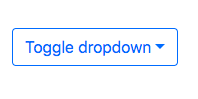
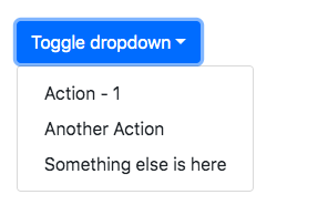
Here’s the code you will need to run to add a dropdown
<div class="row center">

  <div class="col">

    <div ngbDropdown class="d-inline-block">

      <button class="btn btn-outline-primary" id="dropdownBasic1" ngbDropdownToggle>Toggle dropdown</button>

      <div ngbDropdownMenu aria-labelledby="dropdownBasic1">

        <button class="dropdown-item">Action - 1</button>

        <button class="dropdown-item">Another Action</button>

        <button class="dropdown-item">Something else is here</button>

      </div>

    </div>

  </div>

</div>
Accordion
Bootstrap Accordion component makes it simpler to organize content within collapsible items.
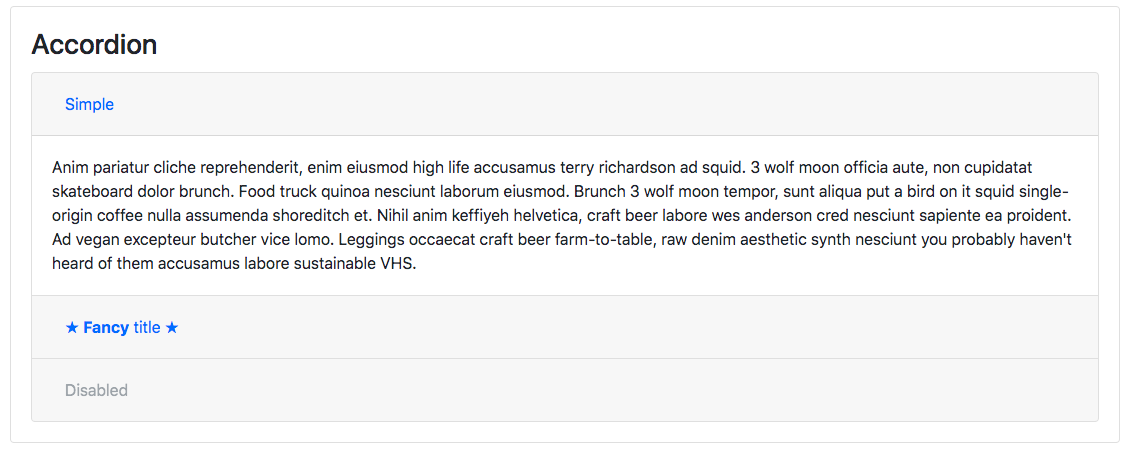
Here’s the code you will need to run to add an accordion
<ngb-accordion #acc="ngbAccordion" activeIds="ngb-panel-0">

            <ngb-panel title="Simple">

              <ng-template ngbPanelContent>

                Anim pariatur cliche reprehenderit, enim eiusmod high life accusamus terry richardson ad squid. 3 wolf moon officia

                              aute, non cupidatat skateboard dolor brunch. Food truck quinoa nesciunt laborum eiusmod. Brunch 3 wolf moon tempor,

                              sunt aliqua put a bird on it squid single-origin coffee nulla assumenda shoreditch et. Nihil anim keffiyeh helvetica,

                              craft beer labore wes anderson cred nesciunt sapiente ea proident. Ad vegan excepteur butcher vice lomo. Leggings

                              occaecat craft beer farm-to-table, raw denim aesthetic synth nesciunt you probably haven't heard of them accusamus

                               labore sustainable VHS.

                           </ng-template>

                          </ngb-panel>

                         <ngb-panel>

                         <ng-template ngbPanelTitle>

                          <span>★ <b>Fancy</b> title ★</span>

                          </ng-template>

                        <ng-template ngbPanelContent>

                  Anim pariatur cliche reprehenderit, enim eiusmod high life accusamus terry richardson ad squid. 3 wolf moon officia

                         aute, non cupidatat skateboard dolor brunch. Food truck quinoa nesciunt laborum eiusmod. Brunch 3 wolf moon tempor,

                         sunt aliqua put a bird on it squid single-origin coffee nulla assumenda shoreditch et. Nihil anim keffiyeh helvetica,

                         craft beer labore wes anderson cred nesciunt sapiente ea proident. Ad vegan excepteur butcher vice lomo. Leggings

                        occaecat craft beer farm-to-table, raw denim aesthetic synth nesciunt you probably haven't heard of them accusamus

                         labore sustainable VHS.

                     </ng-template>

                    </ngb-panel>

                    <ngb-panel title="Disabled" [disabled]="true">

                     <ng-template ngbPanelContent>

              Anim pariatur cliche reprehenderit, enim eiusmod high life accusamus terry richardson ad squid. 3 wolf moon officia

                     aute, non cupidatat skateboard dolor brunch. Food truck quinoa nesciunt laborum eiusmod. Brunch 3 wolf moon tempor,

                    sunt aliqua put a bird on it squid single-origin coffee nulla assumenda shoreditch et. Nihil anim keffiyeh helvetica,

                    craft beer labore wes anderson cred nesciunt sapiente ea proident. Ad vegan excepteur butcher vice lomo. Leggings

                   occaecat craft beer farm-to-table, raw denim aesthetic synth nesciunt you probably haven't heard of them accusamus

                   labore sustainable VHS.

                    </ng-template>

                   </ngb-panel>

                 </ngb-accordion>
Popover
Bootstrap Popover component is a pop-up box, which appears automatically when users click on an element.
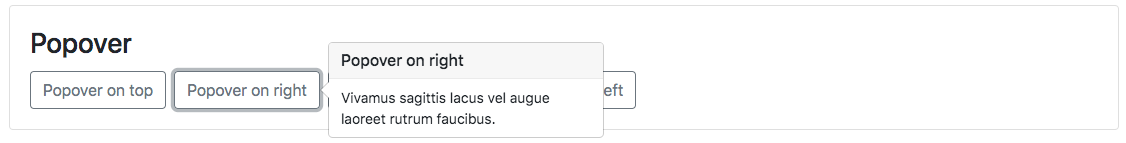
Here’s the code you will need to run to add a popover
<button type="button" class="btn btn-outline-secondary mr-2" placement="top"

            ngbPopover="Vivamus sagittis lacus vel augue laoreet rutrum faucibus." popoverTitle="Popover on top">

            Popover on top

          </button>

          <button type="button" class="btn btn-outline-secondary mr-2" placement="right"

            ngbPopover="Vivamus sagittis lacus vel augue laoreet rutrum faucibus." popoverTitle="Popover on right">

            Popover on right

          </button>

          <button type="button" class="btn btn-outline-secondary mr-2" placement="bottom"

            ngbPopover="Vivamus sagittis lacus vel augue laoreet rutrum faucibus." popoverTitle="Popover on bottom">

            Popover on bottom

          </button>

          <button type="button" class="btn btn-outline-secondary mr-2" placement="left"

            ngbPopover="Vivamus sagittis lacus vel augue laoreet rutrum faucibus." popoverTitle="Popover on left">

            Popover on left

          </button>
Tab
Tab based navigations offers a simple way to organize content into separate panes, where only one of them is visible at a time.
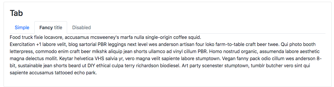
Here’s the code you will need to run to add a tab
<ngb-tabset [destroyOnHide]="false">

            <ngb-tab title="Simple">

              <ng-template ngbTabContent>

                <p>

               <p>Exercitation +1 labore velit, blog sartorial PBR leggings next level wes anderson artisan four loko farm-to-table

                 craft beer twee. Qui photo booth letterpress, commodo enim craft beer mlkshk aliquip jean shorts ullamco ad vinyl

                cillum PBR. Homo nostrud organic, assumenda labore aesthetic magna delectus mollit. Keytar helvetica VHS salvia

                yr, vero magna velit sapiente labore stumptown. Vegan fanny pack odio cillum wes anderson 8-bit, sustainable jean

                shorts beard ut DIY ethical culpa terry richardson biodiesel. Art party scenester stumptown, tumblr butcher vero

                sint qui sapiente accusamus tattooed echo park.</p>

                </p>

              </ng-template>

            </ngb-tab>

            <ngb-tab>

              <ng-template ngbTabTitle><b>Fancy</b> title</ng-template>

              <ng-template ngbTabContent>Food truck fixie locavore, accusamus mcsweeney's marfa nulla single-origin coffee squid.

                <p>Exercitation +1 labore velit, blog sartorial PBR leggings next level wes anderson artisan four loko farm-to-table

                craft beer twee. Qui photo booth letterpress, commodo enim craft beer mlkshk aliquip jean shorts ullamco ad vinyl

                cillum PBR. Homo nostrud organic, assumenda labore aesthetic magna delectus mollit. Keytar helvetica VHS salvia

                yr, vero magna velit sapiente labore stumptown. Vegan fanny pack odio cillum wes anderson 8-bit, sustainable jean

                shorts beard ut DIY ethical culpa terry richardson biodiesel. Art party scenester stumptown, tumblr butcher vero

                sint qui sapiente accusamus tattooed echo park.</p>

              </ng-template>

            </ngb-tab>

            <ngb-tab title="Disabled" [disabled]="true">

              <ng-template ngbTabContent>

                <p>Sed commodo, leo at suscipit dictum, quam est porttitor sapien, eget sodales nibh elit id diam. Nulla facilisi. Donec egestas ligula vitae odio interdum aliquet. Duis lectus turpis, luctus eget tincidunt eu, congue et odio. Duis pharetra et nisl at faucibus. Quisque luctus pulvinar arcu, et molestie lectus ultrices et. Sed diam urna, egestas ut ipsum vel, volutpat volutpat neque. Praesent fringilla tortor arcu. Vivamus faucibus nisl enim, nec tristique ipsum euismod facilisis. Morbi ut bibendum est, eu tincidunt odio. Orci varius natoque penatibus et magnis dis parturient montes, nascetur ridiculus mus. Mauris aliquet odio ac lorem aliquet ultricies in eget neque. Phasellus nec tortor vel tellus pulvinar feugiat.</p>

              </ng-template>

            </ngb-tab>

          </ngb-tabset>
Sample Page
Here is an example of a sample page we have created using multiple Bootstrap components.
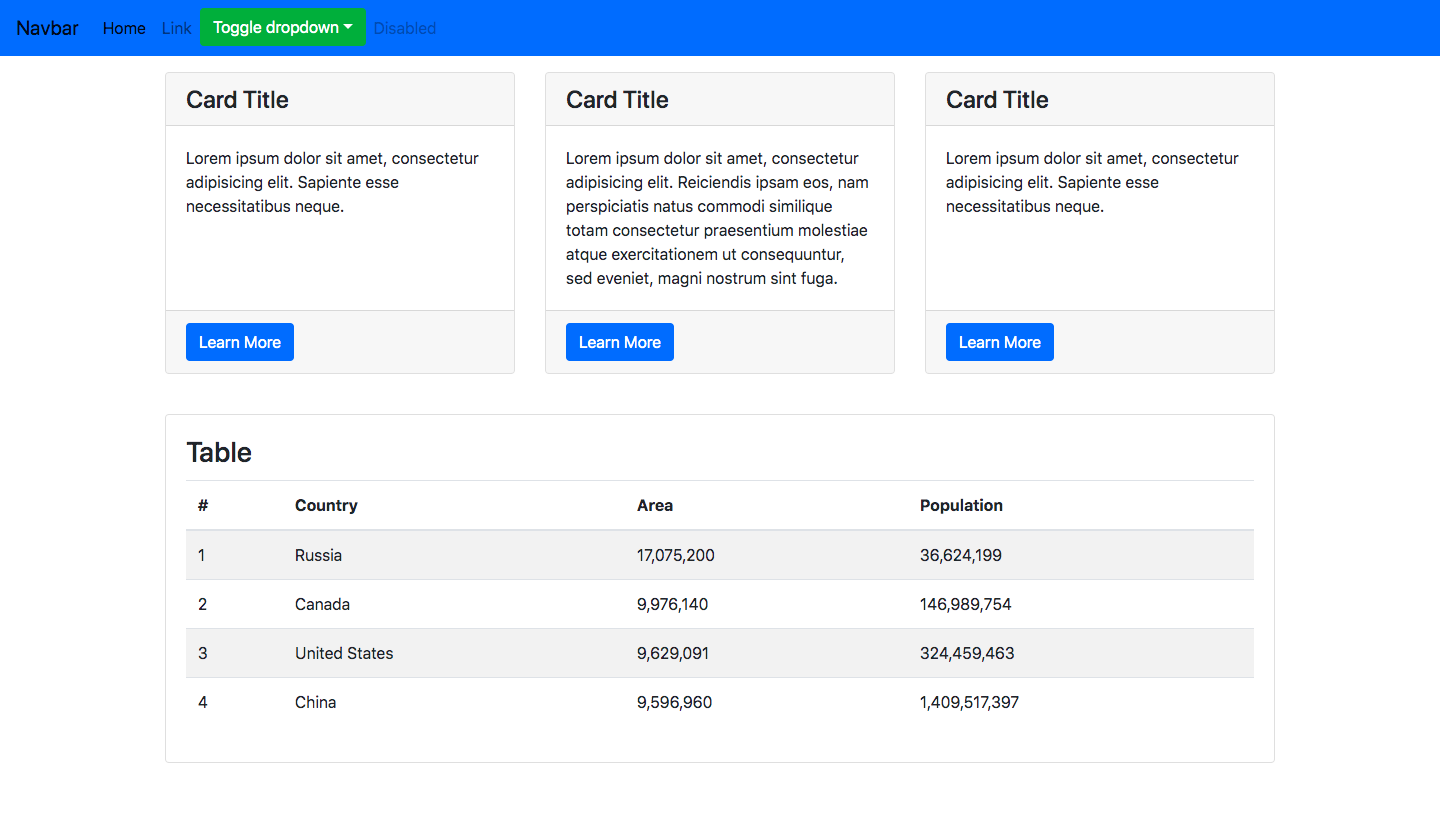
The code to create such a sample page is given below.
<header>
  <nav class="navbar navbar-expand-lg navbar-light bg-primary">

    <a class="navbar-brand" href="#">Navbar</a>

    <button class="navbar-toggler" type="button" data-toggle="collapse" data-target="#navbarSupportedContent" aria-controls="navbarSupportedContent" aria-expanded="false" aria-label="Toggle navigation">

      <span class="navbar-toggler-icon"></span>

    </button>

    <div class="collapse navbar-collapse" id="navbarSupportedContent">

      <ul class="navbar-nav mr-auto">

        <li class="nav-item active">

          <a class="nav-link" href="#">Home <span class="sr-only">(current)</span></a>

        </li>

        <li class="nav-item">

          <a class="nav-link" href="#">Link</a>

        </li>

        <li class="nav-item dropdown">

          <div ngbDropdown class="d-inline-block">

            <button class="btn btn-success" id="dropdownBasic1" ngbDropdownToggle>Toggle dropdown</button>

            <div ngbDropdownMenu aria-labelledby="dropdownBasic1">

              <button ngbDropdownItem>Action - 1</button>

              <button ngbDropdownItem>Another Action</button>

              <button ngbDropdownItem>Something else is here</button>

            </div>

          </div>

        </li>

        <li class="nav-item">

          <a class="nav-link disabled" href="#">Disabled</a>

        </li>

      </ul>

    </div>

  </nav>

</header>

<div class="container mt-3">

  <div class="row">

    <div class="col-lg-4 mb-4 grid-margin">

      <div class="card h-100">

          <h4 class="card-header">Card Title</h4>

          <div class="card-body">

            <p class="card-text">Lorem ipsum dolor sit amet, consectetur adipisicing elit. Sapiente esse necessitatibus neque.</p>

          </div>

          <div class="card-footer">

            <Button class="btn btn-primary">Learn More</Button>

          </div>

      </div>

    </div>

    <div class="col-lg-4 mb-4 grid-margin">

      <div class="card h-100">

          <h4 class="card-header">Card Title</h4>

          <div class="card-body">

            <p class="card-text">Lorem ipsum dolor sit amet, consectetur adipisicing elit. Reiciendis ipsam eos, nam perspiciatis natus commodi similique totam consectetur praesentium molestiae atque exercitationem ut consequuntur, sed eveniet, magni nostrum sint fuga.</p>

          </div>

          <div class="card-footer">

            <Button class="btn btn-primary">Learn More</Button>

          </div>

      </div>

    </div>

    <div class="col-lg-4 mb-4 grid-margin">

      <div class="card h-100">

          <h4 class="card-header">Card Title</h4>

          <div class="card-body">

            <p class="card-text">Lorem ipsum dolor sit amet, consectetur adipisicing elit. Sapiente esse necessitatibus neque.</p>

          </div>

          <div class="card-footer">

            <Button class="btn btn-primary">Learn More</Button>

          </div>

      </div>

    </div>

</div>

  <div class="row">

    <div class="col-sm-12 mt-3">

      <div class="card">

        <div class="card-body">

          <h3 class="card-title">Table</h3>

          <table class="table table-striped">

            <thead>

            <tr>

              <th scope="col">#</th>

              <th scope="col">Country</th>

              <th scope="col">Area</th>

              <th scope="col">Population</th>

            </tr>

            </thead>

            <tbody>

            <tr>

              <td>1</td>

              <td>Russia</td>

              <td>17,075,200 </td>

              <td>36,624,199</td>

            </tr>

            <tr>

              <td>2</td>

              <td>Canada</td>

              <td>9,976,140 </td>

              <td>146,989,754</td>

            </tr>

            <tr>

              <td>3</td>

              <td> United States </td>

              <td>9,629,091 </td>

              <td>324,459,463</td>

            </tr>

            <tr>

              <td>4</td>

              <td>China</td>

              <td>9,596,960</td>

              <td>1,409,517,397</td>

            </tr>

            </tbody>

          </table>

        </div>

      </div>

    </div>

  </div>

</div>
BootstrapDash believes in providing the best, most efficient, and quality bootstrap admin template to get your web application up and running easily and quickly.
Comments(3)
Amazing Admin Templates with Bootstrap CSS Framework
May 18, 2018
[…] SB Admin admin template is based on Angular 4 and Bootstrap 4. This responsive admin template is one of the most popular admin templates and is completely free to download. This free template comes packed with features and UI elements. You can check out How to Use Bootstrap 4 with Angular […]
moshikamit
August 17, 2019
Hi
I’ve done everything you’ve written till NgbModule.forRoot(), here I get an error that forRoot() is unknown.
So I left only NgModule.
Now I run ng serve and I get warnings.
What can I do?
Moshik
Aakash
August 19, 2019
Hi Moshikamit!
Thanks for bringing this to our attention. In the latest version of ng-bootstrap, there is no need for adding forRoot(). We have edited our article with the updated steps.
To remove the warnings, do the following:
1. Remove the current version of @angular/core by doing npm uninstall @angular/core.
2. Install the latest version of @angular/core by doing npm install -s @angular/core.
3. Try ng serve again.