
Bootstrap and React continue to be the most popular choice of developers when building powerful web applications. Most web developers rely on these two frameworks when they are developing web apps. So, it has become necessary to explore methods in which Bootstrap can be used with React. Using native bootstrap templates with React is not as easy as it seems.
This is because Bootstrap heavily relies on jQuery for powering some of its components. So, we will need to find a way to remove the jQuery dependency of Bootstrap before integrating it with React. You can find several libraries like React Bootstrap and React strap that allows developers to focus on their project without worrying about jQuery dependency. In this example, we will be using React Bootstrap.
Getting Started
Here is a detailed and step-by-step guide on how to start a react project with React Bootstrap. There are multiple ways through which you can start a project. We will be using Create React App in our example, as it offers a comfortable environment to developers when building single-page applications. You could manage this whole process by using requirements management software. The first step is to install Create React App in your system.
Installing Create React App in Your System
You can use the following command to install Create React App on your system.
$ npm install create-react-app
After installing Create React App, create a new project with the help of the code given below.
$ create-react-app my-app
Now, open the new project and use the following code to serve it.
$ cd my-app
$ npm start
The newly created project will now be running in your web browser.
Installing React Bootstrap
The command you will need to run to install React Bootstrap on your system is given below.
$ npm install react-bootstrap
In order to ensure that React Bootstrap is working smoothly and perfectly, you must install Bootstrap too. Use the following code to install Bootstrap.
$ npm install bootstrap
Importing Stylesheets
The next step is to find the App.css file within the project and import the Bootstrap CSS files into it.
import 'bootstrap/dist/css/bootstrap.min.css';
Instead of importing bootstrap CSS as shown above, you can also use CDN to do the same.
<link
  rel="stylesheet"
  href="https://maxcdn.bootstrapcdn.com/bootstrap/4.3.1/css/bootstrap.min.css"
  integrity="sha384-ggOyR0iXCbMQv3Xipma34MD+dH/1fQ784/j6cY/iJTQUOhcWr7x9JvoRxT2MZw1T"
  crossorigin="anonymous"
/>
Importing React Bootstrap Components
You have to import individual components instead of importing the entire library. This allows you to specifically pull out only the components you need. Now, identify the App.js file from your project and simply include the corresponding code to import each separate component. For example, here is the code to import the button.
import { Button } from 'react-bootstrap';
How to Use React Bootstrap Components
Here are a few examples of how you can use Buttons, Accordions, Tabs, and other Bootstrap components in your project.
Buttons
Bootstrap Buttons are components that can be used to trigger a desirable action from users.

You can create the above design by running the following code.
import { Button } from 'react-bootstrap';
function App() {
  return (
        <div className="App">
            <Button variant="primary" className="mr-2">Primary</Button>
            <Button variant="secondary" className="mr-2">Secondary</Button>
            <Button variant="success" className="mr-2">Success</Button>
            <Button variant="warning" className="mr-2">Warning</Button>
            <Button variant="danger" className="mr-2">Danger</Button>
            <Button variant="info" className="mr-2">Info</Button>
            <Button variant="light" className="mr-2">Light</Button>
            <Button variant="dark" className="mr-2">Dark</Button>
            <Button variant="link" className="mr-2">Link</Button>
      </div>
 );
}
Accordions
Bootstrap Accordions makes it possible for designers to effectively organize contents within collapsible items.
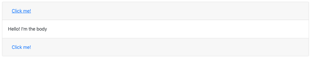
Here is the code you will need to create the above-mentioned design.
import { Accordion, Card } from 'react-bootstrap';

function App() {
  return (
     <div className="App">
            <Accordion defaultActiveKey="0">
                 <Card>
                      <Card.Header>
                             <Accordion.Toggle as={Button} variant="link" eventKey="0">
                             Click me!
                            </Accordion.Toggle>
                    </Card.Header>
                    <Accordion.Collapse eventKey="0">
                          <Card.Body>Hello! I'm the body</Card.Body>
                    </Accordion.Collapse>
             </Card>
             <Card>
                  <Card.Header>
                        <Accordion.Toggle as={Button} variant="link" eventKey="1">
                        Click me!
                        </Accordion.Toggle>
                 </Card.Header>
                 <Accordion.Collapse eventKey="1">
                      <Card.Body>Hello! I'm another body</Card.Body>
                 </Accordion.Collapse>
          </Card>
      </Accordion>
   </div>
 );
}
Tabs
Tabs can be used to divide content into different panes in a simple but effective way.
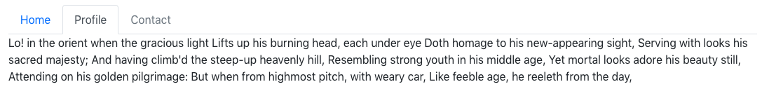
The code required to create a Bootstrap tab just as in the above example is given below.
 import { Tab ,Tabs } from 'react-bootstrap';

 function App() {
    return (
       <div className="App">
               <Tabs defaultActiveKey="profile" id="uncontrolled-tab-example">
                     <Tab eventKey="home" title="Home">
                          <p>
                             Lo! in the orient when the gracious light Lifts up his burning head, each under eye Doth homage to his new-appearing sight, Serving with looks his sacred majesty; And having climb'd the steep-up heavenly hill, Resembling strong youth in his middle age, Yet mortal looks adore his beauty still, Attending on his golden pilgrimage: But when from highmost pitch, with weary car, Like feeble age, he reeleth from the day,
                          </p>
                </Tab>
                <Tab eventKey="profile" title="Profile">
                       <p>
                          Lo! in the orient when the gracious light Lifts up his burning head, each under eye Doth homage to his new-appearing sight, Serving with looks his sacred majesty; And having climb'd the steep-up heavenly hill, Resembling strong youth in his middle age, Yet mortal looks adore his beauty still, Attending on his golden pilgrimage: But when from highmost pitch, with weary car, Like feeble age, he reeleth from the day,
                      </p>
                </Tab>
                <Tab eventKey="contact" title="Contact" disabled>
                     <p>
                        Lo! in the orient when the gracious light Lifts up his burning head, each under eye Doth homage to his new-appearing sight, Serving with looks his sacred majesty; And having climb'd the steep-up heavenly hill, Resembling strong youth in his middle age, Yet mortal looks adore his beauty still, Attending on his golden pilgrimage: But when from highmost pitch, with weary car, Like feeble age, he reeleth from the day,
                     </p>
                </Tab>
        </Tabs>
        </div>
  );
}
A Sample Page Example With Multiple Components
In the following example, we have used multiple Bootstrap components in a single sample page design.
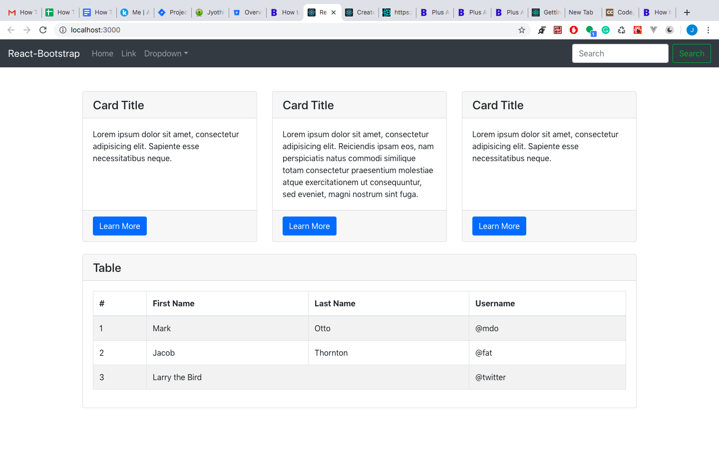
Run the following code to create such a sample page.
import React from 'react';
import './App.scss';
import { Navbar, Nav, NavDropdown, Form,  FormControl, Button, Table} from 'react-bootstrap';
function App() {
  return (
    <div className="App">
      <header>
        <Navbar expand="lg" variant="dark" bg="dark">
          <Navbar.Brand href="#home">React-Bootstrap</Navbar.Brand>
            <Navbar.Toggle aria-controls="basic-navbar-nav" />
              <Navbar.Collapse id="basic-navbar-nav">
                <Nav className="mr-auto">
                  <Nav.Link href="#home">Home</Nav.Link>
                  <Nav.Link href="#link">Link</Nav.Link>
                  <NavDropdown title="Dropdown" id="basic-nav-dropdown">
                    <NavDropdown.Item>Action</NavDropdown.Item>
                    <NavDropdown.Item>Another action</NavDropdown.Item>
                    <NavDropdown.Item>Something</NavDropdown.Item>
                    <NavDropdown.Divider />
                    <NavDropdown.Item href="#action/3.4">Separated link</NavDropdown.Item>
                </NavDropdown>
              </Nav>
              <Form inline>
                <FormControl type="text" placeholder="Search" className="mr-sm-2" />
                <Button variant="outline-success">Search</Button>
              </Form>
          </Navbar.Collapse>
        </Navbar>
      </header>
      <div className="container">
        <div className="row mt-5">
            <div className="col-lg-4 mb-4 grid-margin">
              <div className="card h-100">
                  <h4 className="card-header">Card Title</h4>
                  <div className="card-body">
                    <p className="card-text">Lorem ipsum dolor sit amet, consectetur adipisicing elit. Sapiente esse necessitatibus neque.</p>
                  </div>
                  <div className="card-footer">
                    <Button variant="btn btn-primary">Learn More</Button>
                  </div>
              </div>
            </div>
            <div className="col-lg-4 mb-4 grid-margin">
              <div className="card h-100">
                  <h4 className="card-header">Card Title</h4>
                  <div className="card-body">
                    <p className="card-text">Lorem ipsum dolor sit amet, consectetur adipisicing elit. Reiciendis ipsam eos, nam perspiciatis natus commodi similique totam consectetur praesentium molestiae atque exercitationem ut consequuntur, sed eveniet, magni nostrum sint fuga.</p>
                  </div>
                  <div className="card-footer">
                    <Button variant="btn btn-primary">Learn More</Button>
                  </div>
              </div>
            </div>
            <div className="col-lg-4 mb-4 grid-margin">
              <div className="card h-100">
                  <h4 className="card-header">Card Title</h4>
                  <div className="card-body">
                    <p className="card-text">Lorem ipsum dolor sit amet, consectetur adipisicing elit. Sapiente esse necessitatibus neque.</p>
                  </div>
                  <div className="card-footer">
                    <Button variant="btn btn-primary">Learn More</Button>
                  </div>
              </div>
            </div>
        </div>
        <div className="row mb-4">
          <div className="col-sm-12 grid-margin">
            <div className="card h-100">
              <h4 className="card-header">Table</h4>
              <div className="card-body">
                <Table striped bordered hover>
                  <thead>
                    <tr>
                      <th>#</th>
                      <th>First Name</th>
                      <th>Last Name</th>
                      <th>Username</th>
                    </tr>
                  </thead>
                  <tbody>
                    <tr>
                      <td>1</td>
                      <td>Mark</td>
                      <td>Otto</td>
                      <td>@mdo</td>
                    </tr>
                    <tr>
                      <td>2</td>
                      <td>Jacob</td>
                      <td>Thornton</td>
                      <td>@fat</td>
                    </tr>
                    <tr>
                      <td>3</td>
                      <td colSpan="2">Larry the Bird</td>
                      <td>@twitter</td>
                    </tr>
                  </tbody>
                </Table>
              </div>
            </div>
          </div>
        </div>
      </div>
    </div>
  );
}
export default App;
Looking for more? Check out all our react admin templates and our list of recommended react dashboard templates here!