Web design trends are constantly changing and evolving. There is always something new and fresh to look forward to. This year also brings a set of design trends. Some of the design trends have been replaced, some are still there with minor changes. It is always a challenge to stand out in the crowd when starting out a new project. The design has to be unique in a way that it remains in the memory of the user and creates a lasting impression.
Micro Interactions
Micro Interactions are really taking over the web design this year. Micro-interactions server for communicating statuses or feedback, showing results from particular actions, helping manipulations etc. Micro-interactions are very useful in communication to help the users navigate the interface. They perform the basic functions like communicating feedbacks or results for the users’ actions, accomplish tasks, and prevent errors. Micro-interactions can make even the complex logic understandable to the common users in the simplest way possible.Micro-interactions are different from animations in the sense that micro-interactions do not just create an illusion of movement. Micro-interactions engage and interact with the user to perform a specific task in an intuitive and effective way.
Micro-interaction can take many forms depending on the brand of the website. They can be formal, to-the-point or can be cartoonish and fun. The presence of micro-interactions makes the experience with the interface more entertaining.
Colors
Go excess vibrant with colors in 2018. There is no doubt that flashy vibrant colors are eye-catching and grab user attention. They are quite useful to set your website apart from the rest of the websites. People have been using more web-safe colors for their websites. But now more designers going more courageous with their choice of bold and vibrant colors.
The technological advancements in monitors and screen devices have opened the door for more possibilities that were not there before. Now the designers can go for more vibrant colors and experiment with the colors that will look amazing on such devices.
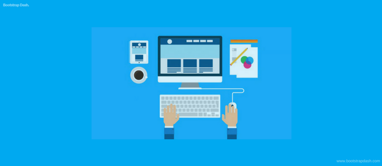
Custom Illustrations
It’s high time that you move away from those stock photos. If you are using custom images for your website, it’s better than using the stock images but still, its time for them to go away too. Custom illustrations can be used to show an artistic side of your website. Custom illustrations are something that created just for your website and they represent the mood and personality of your website.
Custom illustrations have many interesting advantages. First of all, there is no limit to what you can create when using a custom illustration. These illustrations do not get outdated quickly. So, it will make keep giving that unique look for years. You can also create a mix-and-match of photographs and illustrations to give a different look to your website’s brand.
Gradients
The transition of one hue to another in web designs is back. Gradients are going to rule this year’s web design. If you look into nature, gradients are everywhere. Everything from the flowers and to the sky, the colors change from a lighter shade to darker or vice versa. The year 2018 is seeing the obsession with the flat design is starting to fade away. Gradients seem like the best thing after the flat design. They give more option of colors to the designers with a mixing of multiple colors and the subtle transition of one color to another does not make the interface look crowded with colors.
You can create gradients for two or more colors of your choice. But when choosing the colors, it should not look like they have been picked randomly. Choose colors that are closer to each other in the spectrum. This will create a smoother transition as opposed to the colors that are complementary to each other. The best place to draw inspiration is from the color gradients in nature.
Dynamic Gradients – This is a trend to watch out for this year. The designers are not only bringing back the more sophisticated gradients but also bringing a dynamicity to it. This means that you achieve animated gradients using CSS and/or JavaScript, which create stunning visual effects to the user. The colors in the gradients create an illusion of continuously mixing together to create different shades.
Typography
The trend for bold and bigger typography continues in the year 2018. The bold and bigger typography helps in getting the users attention in the first look. It also helps in conveying the brand of your website with ease. So choosing the right typography is important and big and bold is the right way to go.
But it’s not just about the bold and big typography. Looking at how the resolutions of the viewing devices have been changing, you can do a lot with the typography this year. You can experiment with different types of typography. Make creative word art with your typography, use gradients to the text or use transparent text over a multi-color background, create layers of images and text – make the texts and images overlap. The sky is the limit.
The important thing to keep in mind is the readability of the text. The typography you choose should not deviate from its primary purpose – the readability and represent the brand of the website.
Isometric Design
Isometric design is how you create a 3-dimensional object on the 2-D plane. As flat design practices lose its popularity designs no longer need to be flat. Isometric designs make the design resemble the natural physical environment. It gives the depth and shadows needed in the web design. Combined with custom illustrations, isometric design can produce a different world on the screen.
Broken Grid and Asymmetry
The grid has been a favorite among the designers since they arrived. They give the much-needed organization and clarity to the interface and also responsiveness. But the grid system always follows a specific structure to create a layout. But what if you want to break away from the monotonous grid structure and do something different. The designers have now started to question the regular grid structure and bring a little “organized chaos” to the interface.
Even though the broken grid structure makes for a great looking interface, But it takes a skilled designer to create a broken or uneven grid structure. The design should take care of the responsiveness – how the interface would look on different devices and should create a bad user experience. It should not create confusion for the users in navigating the website. This makes it necessary that the designer should know ins and outs of the grid structure.
Particle Backgrounds
Websites have adopted videos as backgrounds of their website. Though they are a great tool to increase user engagement on the website and better than texts or images in conveying the brand image of your website, they create serious performance issues. Videos are larger in size and take a lot of time to load. Slow loading time has a negative effect on the site’s SEO.
The best alternative to this trend is the particle background. The best part of it is that it can be created with a little bit of HTML, CSS, and JavaScript. Which makes it very lightweight and does not create much performance issues if at all. Particle backgrounds immediately catch the users attention and create a lasting impression of the brand.
Studies have shown that the users don’t wait more than 2 or 3 seconds for a website to load. If the website takes more time to load, the bounce rate of the website increases. Using particle background can significantly improve user engagement and thus decrease the bounce rate. Sometimes much to the user’s amusement, the particle react to the movement of the mouse or the particles move at different speeds, collide, or even dance.
Minimalism
Less is still more in web design. Minimalist design helps get more attention to the actual content of the application. This means more white spaces, not cramped with a lot of text, less and meaningful use of colors and other components. Clever animations in design that does not take the attention from the content improve the usability of the website and leaves a very good impression on the user.
Minimalism helps in conveying the message of the website in the first look. Rather than confusing the user where to look, the minimal design makes it easy to navigate through the site and provides a better user experience.
Material Design
Released in the year 2014, it has undergone major changes over the years. This year is the year of components with drop shadows and depth. With the progress of web browsers, drop shadows and depth have started to create a different world on the screen. They create a more pleasing aesthetics to the UI and creates for better user experience by giving emphasis.
This is where material design shows its significance. The Material Design framework is a flexible design language that has endless possibilities. And makes use of the basic principles of how a material behaves in the real world. Though the flat design is still is being used by designers, it’s losing its popularity. It would not be a wise idea to not to take advantage of the latest design principles, sophisticated web browsers, and their capabilities.
Mobile first and responsiveness
If you still are not up with the responsive design, you must have been living under a rock or you don’t take your web design seriously. Everything on the web is now going responsive and mobile-first. This is the straight result of ever-increasing traffic from mobile devices. So to call it a trend would be wrong, its a necessity now. If you want to be ranked higher in Google, it won’t be possible until and unless you go responsive. Google’s priority has changed to mobile-first, responsive websites and for good reasons.
One of the latest trends in responsive design is responsive logos. Many popular brands have optimized their logo in a way that they represent their brand in viewports of all sizes. Some have chosen a custom logo maker, and others have hired a professional to get the job done. Use logo maker tool and create an eye-catching logo design appropriate to your brand style. This helps the brands to reach out to all their audiences irrespective of their device.
Wrapping Up
Keeping up with the trends is a necessity for users to take you more seriously. It improves the quality of your design and the user experience. Adopting the changes are important in the learning and growing part of a website. And most importantly people have a whole different experience interacting with the website.