Have you noticed how quickly technology and the internet are changing? It seems like new devices come out every other day! With all these changes, it’s more important than ever to ensure that websites can be viewed on any device or screen size, emphasizing the need for responsive design.
What is Responsive Web Design?
Responsive web design is the way of web designing that makes web pages fit into any device screen while viewing. As more and more people access websites through mobile phones, tablets, laptops, and many such responsive web designs have become an important aspect of web development.
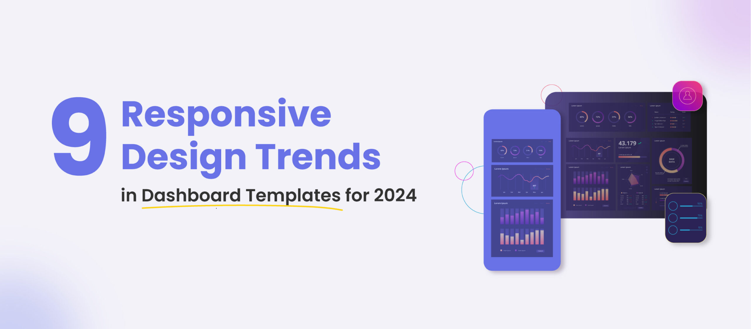
Dashboard templates, with their structured layouts and functionality, emerge as invaluable tools in navigating this dynamic digital landscape based on the pattern established in 2023 and current trends, we have compiled a list of responsive design trends for dashboard templates in 2024.
Responsive Design Trends in Dashboard Templates for 2024
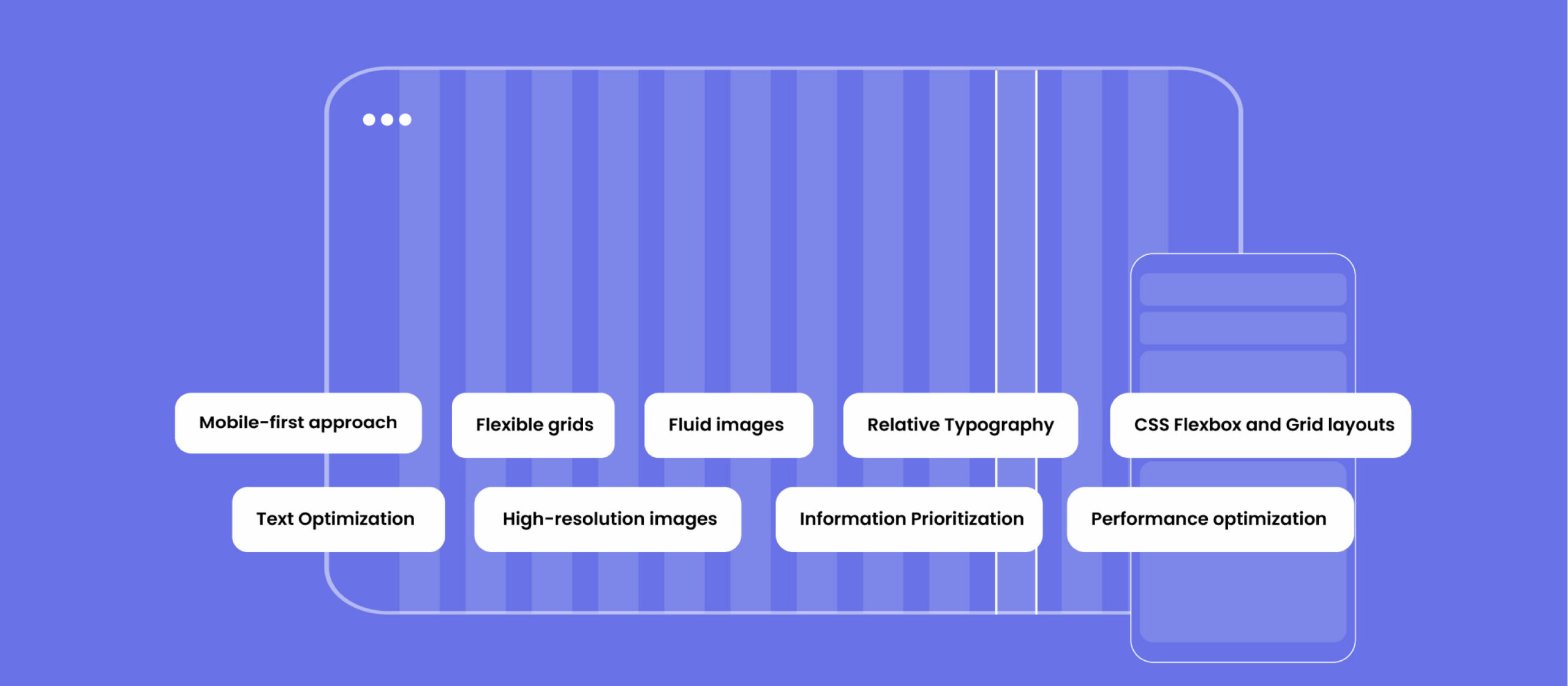
1.Mobile-first Approach
The mobile-first approach literally begins by designing websites for mobile devices and then gradually enhancing them for larger screens. The increased dominance of mobile users has paved the way for this approach.
By starting with the smallest sized and the most used screen, you ensure that your design remains light and focused, with only basic elements. This strategy naturally promotes clarity and efficiency in design. Mobile responsiveness can open the door for many users to access your website and push you to prioritize important content, resulting in faster loading times. Google prioritizes mobile-friendly sites for better search visibility using mobile-first indexing. With the growing number of screen sizes, a mobile-first approach ensures your design is adaptable for any new device.
2.Flexible Grids
Flexible grids use relative units like percentages instead of fixed units like pixels for layout elements. This enables your website’s content to proportionally adjust to all screen sizes, keep consistent proportions, eliminate the need for separate layouts, simplify layout updating process, ensure visual appeal of your images. Flexible grids make the accessibility of your website easy whenever new devices emerge, and enhance content’s readability as it adapts naturally to different screen widths.
3.Fluid Images
A fluid image is a responsive image technique that uses a mathematical calculation to define the width of web page elements. The page layout adjusts to fit the new width based on the viewport’s width or browser window size.
Fluid images are an essential factor in web design. It will automatically adjust to fit their container, providing that they scale proportionally across various screens. This not only stops images from becoming stretched or deformed on larger screens but also upholds a unified design that is aesthetically satisfying across devices. Appropriately sized images contribute to quicker loading times and reduced bandwidth usage, while also improving usability by ensuring that users don’t need to scroll horizontally to view images. Similarly, using fluid images guarantees that designers don’t have to create multiple versions for different devices, making it a practical solution for various screen sizes.
4.Relative Typography
To make a website responsive, the text should be adapted to the characteristics of the device and the preferences of the user. One way to achieve this is by using relative units like em or rem for font sizes. This practice can be very helpful as it allows the text to adjust accordingly and maintain a consistent appearance across different devices.
As the screen size varies, the text automatically adjusts its size without the need for manual adjustments, ensuring a uniform appearance on all devices. Furthermore, the relative font sizing feature is extremely beneficial for designers and developers as it enables them to create accessible content that caters to a wider audience.
5.CSS Flexbox and Grid layouts
CSS Flexbox and Grid layouts are powerful mechanisms for creating complex and flexible designs that adapt seamlessly to different screens. Flexbox focuses on one-dimensional layouts, while Grid handles two-dimensional layouts. By using these features, you can craft intricate and responsive designs easily. Further, Flexbox and Grid simplify complex layouts, bypassing the need for extra HTML or CSS. Grid adjusts content to the available space, preserving design integrity, and allows you to easily center content both vertically and horizontally on different screen sizes. Moreover, you can reorder elements for various screen sizes, improving user experience. It’s important to note that CSS Grid and Flexbox are both well-supported and aligned with the unfolding design standards.
6.Text Optimization
Avoiding Text in Images for optimization is crucial for responsive design. It is recommended to use CSS for text effects instead of incorporating text into images. Text within images can become indistinct when scaled down for smaller screens. By utilizing CSS, you can ensure that text stays readable and retains its formatting on all devices. CSS-rendered text adapts gracefully to different screen sizes, making it useful for responsive design. Further, search engines can index CSS-rendered text, improving SEO.
7.High-resolution Images
Retina-ready images are high-resolution images that are displayed on devices that have high-definition, such as different-sized tablets, smartphones, and some modern laptops, MacBooks, and desktop PCs.
Retina-ready graphics are essential in today’s digital world. Using high-resolution images is crucial for devices having high-density screens like Retina displays. With more pixels per inch, these screens offer sharper and clearer visuals. By providing Retina-ready graphics, you can guarantee that your design maintains its quality and clarity on these advanced screens. High-resolution images prevent pixelation and maintain visual captivation. Most importantly, Retina-ready graphics align with responsive design guides, catering to different devices.
8.Information Prioritization
The content displayed on a web page plays a significant role in determining its responsiveness. The principle of minimalism is also applied to ensure that the pages fit into all devices. By creating a content hierarchy, users can easily locate the core content regardless of their screen size. Moreover, arranging the content explicitly assists users with disabilities or screen readers. Prioritizing the key content can enhance engagement and conversions. In short, a well-defined hierarchy guides users to essential information and ensures that smaller screens can access critical content without excessive scrolling.
9.Performance Optimization
Optimizing performance is an essential element of responsive design. By optimizing codes and images for faster loading times, we can improve user experiences in a great way. Methods like lazy loading for images and minimizing code are pretty effective in enhancing website performance. Optimized assets and code lead to quicker page loading, reducing bounce rates. Besides, lazy loading images saves bandwidth and enhances performance on slow connections. Google also prioritizes faster-loading sites, which can strengthen search engine rankings. Faster websites keep users on the website for a longer time and encourage more exploration, as optimized sites are more available on mobile devices with limited resources.
Conclusion
The landscape of web design is constantly evolving, and in 2024, the emphasis on responsive design is more essential than ever. The trends highlighted in dashboard templates for the year underline the importance of adapting to diverse devices and screen sizes. The mobile-first approach takes center stage, recognizing the dominance of mobile users and promoting simplicity and efficiency in design. As we navigate through the dynamic digital landscape, these responsive design trends for 2024 serve as guiding principles for creating adaptive and user-friendly web experiences.