Getting Started
Before we begin to learn Bootstrap 4 and make our own first website it is essential that we have a good foundation on HTML, CSS, and JavaScript. If you are not confident with your HTML and CSS skills, don’t worry. There are tons of resources that can help you to start from scratch. Here are some resources you can begin with. You may try the following links:
You can also check out these audio-visual tutorials.
Installation
Where to begin?The first step is to include Bootstrap files in your HTML file. You can use any one of the following methods to include bootstrap in your HTML
- Using CDN
- Downloading the files locally
- Using package managers
Read more details and step by step instructions in How to Install Bootstrap
In this tutorial, we are using CDN for installing bootstrap
To add Bootstrap via CDN , do the following steps:
-
Copy this stylesheet link to the
<head>of your HTML file - The JavaScript functionalities of some components like dropdowns, tabs etc depends on jQuery and popper.js. So, include jQuery and popper.js in the following order right before loading the bootstrap JavaScript file for the proper functioning.
Now, our index.html file will look like this:
Now, let’s start creating a responsive one-page template using Bootstrap 4. Our goal is to create a page like this:
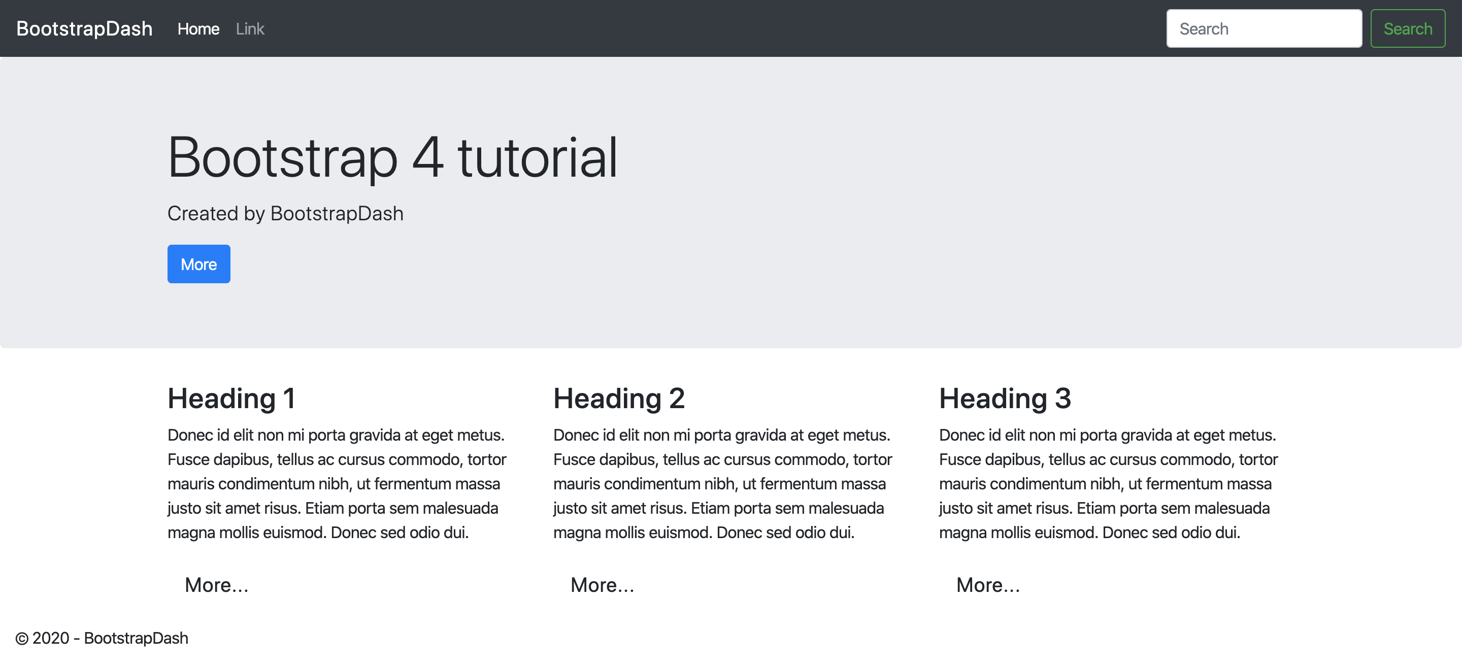
This is a very simple web page created using Bootstrap. Let’s see what all things it consists of - Taking up a significant portion of the page or the large callout is called Bootstrap jumbotron, with the heading Bootstrap 4 and some random paragraph and a button. By default, Bootstrap jumbotron has a light gray color ( Hex value - #eceeef) but we can change its color or add a background image and have fun.
After that, we have three columns in a row with three headings and some contents and a button under each of them.
Above the jumbotron, we have a navigation bar which includes a navigation bar brand, in this case, “BootstrapDash”. We can add the name of the project or the web page logo here. After that, we have a navigation link “Home” and also a search box and a search button.
And finally, We have the footer of the page.
Now that we have established our goal, let’s roll up our sleeves and start coding.
Note: The following section gives a quick guide for creating a page as given in the above image. The detailed tutorial of each of the components used are covered one by one in the components section
Adding the Navigation
Our first task is to create the navigation bar at the top of the page which is only visible for screen sizes of a medium desktop or larger and collapses for smaller screens.
The navbar in our design consist of a menu. a search box and a search button.
Everything to be included in the navigation bar goes into the
<nav> element with class .navbar and
.navbar-expand-lg to change the bootstrap navbar breakpoint. The
navigation bar is fixed to the top with .fixed-top so that when we
scroll down the page the navigation bar stays at the top of the browser window. To
pick out the color scheme of the navbar we have .navbar-dark to use
with the dark background color .bg-dark. Again, we can customize the
navbar with the colors that please our eyes.
Now we add the components in our navbar. For that we have a <div>
with classes .collapse and .navbar-collapse. To add the
navbar links we can simply use the <ul> element. For a
full-height and lightweight navigation and to align the nav-items to the left we add
the classes .navbar-nav and .mr-auto.
We have two links in our navbar. “Home” and “Link”. These two links are added using
an anchor element within the <li> tag. For the “home” navigation
item we have a class .active to indicate the current page. It is recommended to add
a span alerting the screen readers to a link’s active status.
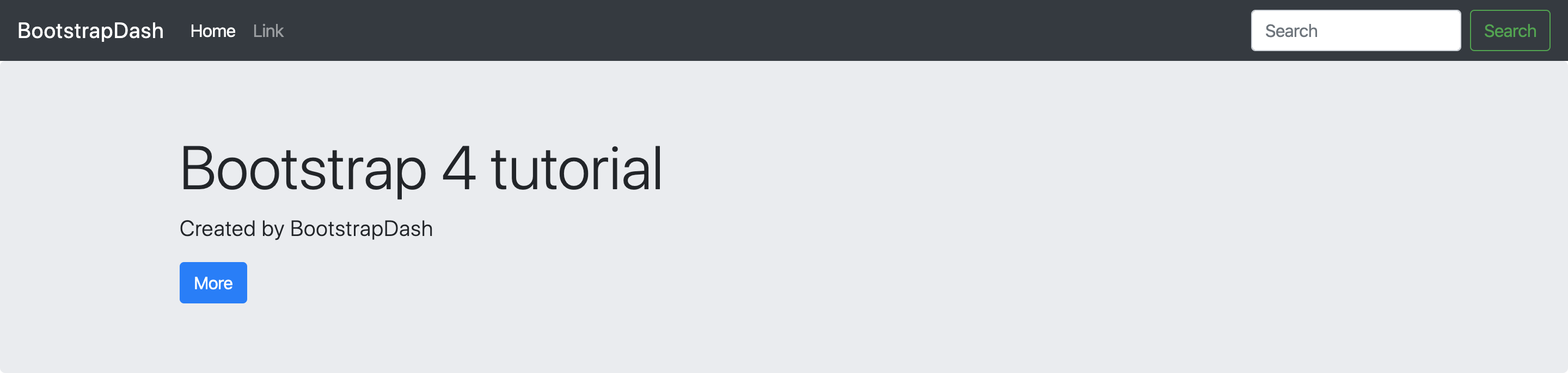
This adds the navbar to our sample page.
The Jumbotron
We start with a <div> with the class .jumbotron to
create our jumbotron and include our heading, a paragraph element and a button inside a
<div> with the class .container.
Note: We can override the default color of the jumbotron or add background images even, using our custom CSS file. But make sure that we add our custom file after bootstrap.min.css so as to be able to override it.
This creates the jumbotron in our sample template.
The three column content
Next, we will add the three column content section. Notice that they are arranged in three columns of equal width per row. This arrangement is for medium desktop or larger screen sizes.
For any device that has a smaller screen size, these columns will arrange themselves one column per row or stack on top of each other. But, we can change this according to our choice. So, let’s see how it’s done.
Create a <div> with the class container. This is where we put all
the contents. Now we need to create a row to arrange our contents. For that, we
create another <div> with the class row. Inside the row, add three divs with class 'col-md-4'.
This will create a row of three columns for screen sizes of a medium desktop or larger.
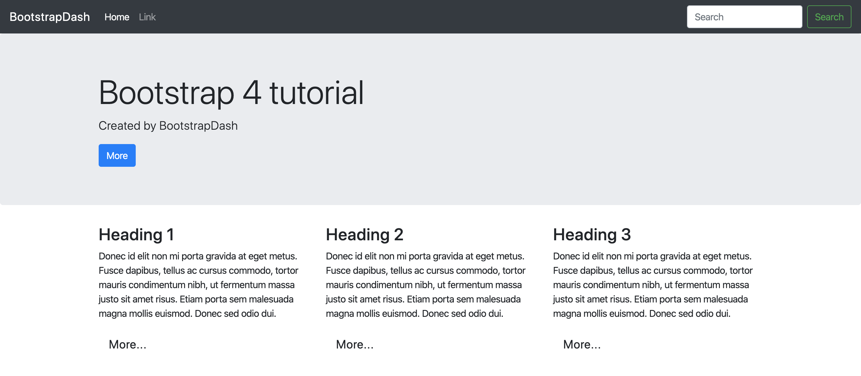
Inside each of these three divs, we have to place our contents - a heading, a small paragraph and “More” button. Let's see the code to do
this.
This makes our contents arranged in three columns of equal width. You will get a screen like this after adding this content.
So what does this class do? For this, first, we have to understand the Bootstrap 4 grid system.
Here, in class ‘col-md-4’ col is for column, md is for medium desktop or larger. So, here we have a greater than or equal to relationship. So for example, if we specify sm instead of md, which is for small screen sizes like for a tablet, we will have three column per row arrangement starting from a tablet level to larger screens.
What about the number 4? Since we are arranging the elements in three columns of equal width, which means we are taking 4 out of twelve grid columns for each of the content. That’s how we get the 4.
You are not limited to create three columns per row or columns of equal width. You can create a different number of columns with different width. Keep in mind that the grid columns should add up to twelve grid columns per row. More than that the columns start stacking on top of each other regardless of the view-port. Learn about Bootstrap grid layout with Bootstrap Grid Examples.
Adding the Footer
Next, on our page, have a footer section. So, we may also add that. It's as simple as it can get. You just need a line of code.
That adds a footer to our page.

Here is the entire code.
Voila! We have built our first Bootstrap template.