Are you in a rush to create a website or app or just an admin dashboard? We hope you know that Bootstrap is the solution for it without an alternative. Bootstrap has cleared the pain points of developers with its exquisite benefits since its beginning. Mark Otto and Jacob Thornton at Twitter developed Bootstrap to ease their tasks and to promote consistency across their internal tools. Later on, they opened it to the whole world and, which is now history!
What is Bootstrap?
Bootstrap is a free, open source CSS Framework for creating mobile-first, responsive and easily adaptable websites. It is a front-end development framework that gives an extensive range of syntax for designing templates. With Bootstrap, designing websites and apps are simplified, which is why many free Bootstrap templates are being developed.
Why is Bootstrap used? Some Common Use Cases of the Framework
Building an appealing and multi-functioning web design is every front-end developer’s vision. However, the process comes with dealing with an overwhelming amount of code that can become redundant and time-consuming over time.
Bootstrap is a powerful front-end framework. This open-source toolkit comprises code dedicated to supporting the front-end web development process. It is hosted and available for public use on GitHub.
Bootstrap is versatile. It is used in diverse web development scenarios. Here are some common use cases for Bootstrap.
1. Responsive Websites
Bootstrap is mainly utilized to create responsive websites that adapt to different screen sizes and devices. Its responsive grid system and components make it easier to develop websites that function well on desktops, tablets, and mobile phones.
2. Web Applications
Many web applications, for instance, content management systems (CMS), e-commerce platforms, and dashboards, use Bootstrap to present a consistent and user-friendly interface. Bootstrap’s CSS and JavaScript enhance the user experience.
3. Admin Dashboards
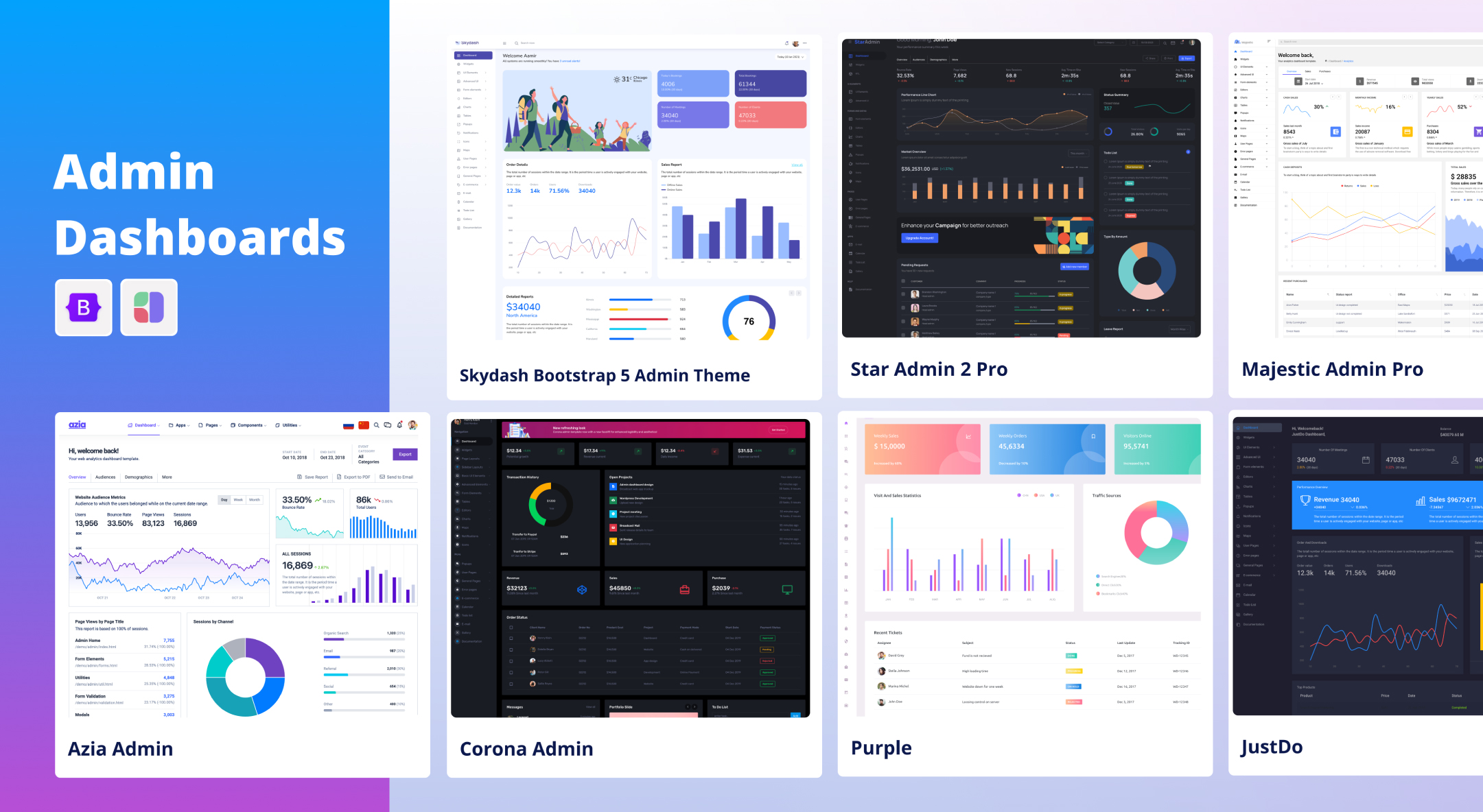
Bootstrap offers pre-designed admin templates and components, making it a popular choice for creating admin dashboards and control panels with necessary functionalities. Developers can quickly set up backend interfaces with features like charts, tables, and forms.
4. Landing Pages
Bootstrap simplifies the development of attractive landing pages for marketing campaigns, seasonal sales, or product launches. Its built-in styles, and responsive design capabilities help designers create compelling one-page websites.
5. Prototyping
Developers often use Bootstrap for quick prototyping of web applications and websites. It lets them create functional prototypes fast, saving time during the design and development stages.
6. E-commerce Sites
Bootstrap’s grid system is well-suited for building product catalogs, shopping carts, and checkout processes on e-commerce websites. Its responsive features also guarantee a seamless shopping experience on mobile devices.
7. Content Publishing
News websites, blogs, and online magazines often adopt Bootstrap for their layouts. It delivers a clean and organized structure for presenting articles, news and multimedia content.
8. Portfolio Websites
Designers and creatives often use Bootstrap to create their portfolio of work. Its flexible components and grid system help demonstrate projects and galleries in an appealing manner.
9. Web Apps with Forms
Bootstrap provides form controls and validation styles, making it an ideal choice for web applications that depend heavily on data input and submission, such as registration forms and search interfaces.
10. Single-Page Applications
While developing SPAs using frameworks like Angular, React, or Vue.js, Bootstrap framework can be incorporated to build consistent UI elements, ensuring a balanced look and feel throughout the application.
11. Corporate Websites
Many businesses and organizations use Bootstrap to establish a professional online presence. It simplifies the development of corporate websites, including about us pages, contact information, and service offerings. According to Stackshare report 42919 companies reportedly use Bootstrap in their tech stacks, including Spotify, Twitter, and Udemy.
12. Educational Platforms
Educational institutions and e-learning platforms employ Bootstrap to design user-friendly and responsive websites or portals for students, teachers, and administrators. They need uncomplicated interfaces with essential functionality. Bootstrap is the perfect choice.
13. Cross-Browser Compatibility
Bootstrap can be used to enhance cross-browser compatibility for already existing websites. By integrating Bootstrap, developers can handle browser-specific issues and ensure consistent rendering.
In short, Bootstrap is a valuable tool for a wide range of web development projects, offering a robust foundation for creating responsive, visually appealing, and user-friendly web interfaces across various industries and applications.
Benefits of Using Bootstrap
1. A Time-Saving Solution for Web Design Projects
Bootstrap can save web development time in designs with similar requirements. Stressing over a project with several templates can be relatively time-taking. Even a small design change can result in hours of manual editing across numerous web pages.
With Bootstrap, you can use ready-made design themes and templates as your beginning point. It lets you change its code to make the framework fit your project’s needs. Moreover, any changes you make during the development process will also impact all the web pages modified by Bootstrap.
2. Easy to Use
Using Bootstrap is an easy process that doesn’t require a lot of time and is relatively straightforward, even for those who are new to it. Having a basic understanding of HTML, CSS, and JavaScript will certainly make it easier for you to modify the code, although it’s not a requirement.
For instance, to create a drop-down select field, the below code is handy.
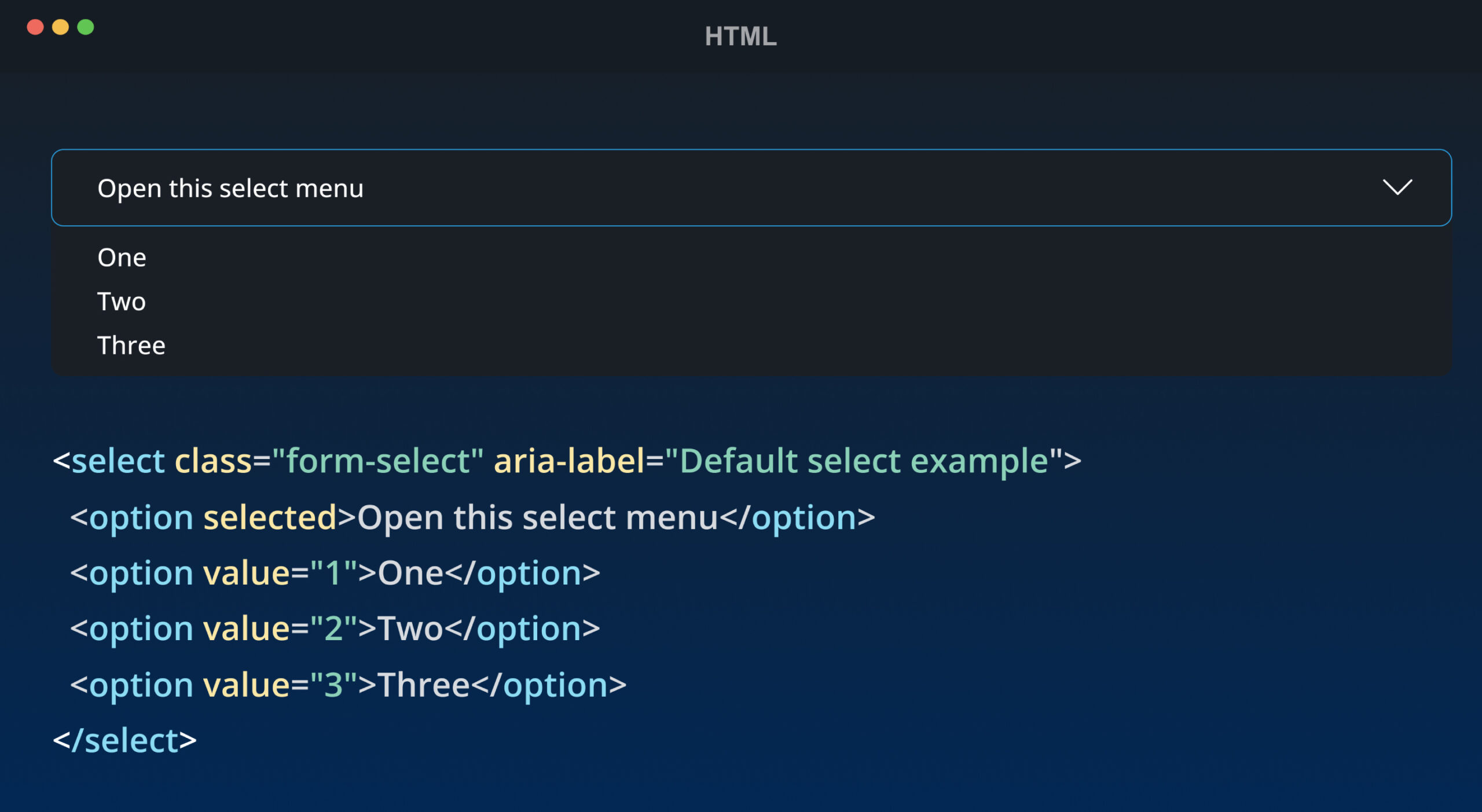
Reference: https://getbootstrap.com/docs/5.3/forms/select/
3. Responsive Grid System: Design for All Devices
One of today’s most significant demands in web development is ensuring responsive websites. Bootstrap has managed that with its dedicated mobile-first grid system. It can divide the screen into twelve columns to accommodate various screen sizes, thus making its web design adaptable to all kinds of devices. Moreover, by taking advantage of the grid system’s classes, you can make certain elements visible only on a specific type of device.
4. Customizable: Make it your own!
If you’re unsatisfied with Bootstrap’s design template, you can add some desired changes to the CSS file. You can also integrate it with the existing code and make them complement each other’s functions. This feature is useful if you want to create a unique look for your website but don’t have the time to start everything from scratch.
You can also create a custom version of Bootstrap via its customization page. To achieve this, you have to exclude all of the components and plugins that you don’t need before downloading the Bootstrap file. Besides, you can create templates of your liking by changing certain variable values in a section.
5. Cross-Browser Compatibility with Responsive Designs
Bootstrap is compatible with different versions of all the latest browsers and platforms. It is designed to be compatible with web browsers, for instance, Chrome, Firefox, Safari, Internet Explorer, Edge, and more. It uses responsive design techniques to ensure cross-browser compatibility. However, Bootstrap claims it doesn’t support older or proxy browsers, which shouldn’t affect its display and function.
6. Maintaining Consistency in the Project
Bootstrap is developed specifically to solve the inconsistency issue between front-end and back-end developers, and they got the desired result. Bootstrap eliminates libraries that always vary from one developer to the other. Thus, you get to retain the stability of your project elements regardless of the number of people handling it. Consistency also applies to the web display, meaning you’ll notice a uniform output independent of what web browser you’ll use for your project.
7. Open Source: Collaborate and Grow
No need to explain, right? You don’t have to own any license to use or modify for your use. Moreover, the community will give you constant support whenever you encounter a roadblock. Hence, it helps your project to grow rapidly with the help of contributors on GitHub.
8. Join the Supportive Bootstrap Community for Tutorials and Updates
Bootstrap has a good community to support who offers tutorials, assistance, and help. The developers constantly keep the community informed by supplying the latest news and updates regarding the framework’s growth through Bootstrap’s official blog.
Disadvantages of using Bootstrap
Bootstrap also has some limitations and challenges. One of them is that it can make your website look too similar to others that use the same framework, unless you customize it extensively. Bootstrap also adds a lot of extra code and files to your website, which can affect its performance and loading speed. Moreover, Bootstrap may not always suit your specific design or functionality needs, as it follows certain conventions and standards that may not match your vision or goals. You may also have to deal with compatibility issues, bugs, or conflicts with other libraries or frameworks.
When should I use Bootstrap?
Depending on the project, a developer has different circumstances to consider Bootstrap over other frameworks or scripts. We’ll go through a few of such situations when you should use Bootstrap.
- When you have a deadline to meet, the first one of course, is saving time.
- Bootstrap can be a time saver if you don’t have time to create from scratch.
- When you want functionality rather than a unique appearance Bootstrap is the best choice.
- When you want a simple cross-browser app or website with features like toggles, carousels, pop-ups, drop-downs, etc.
- When you want a responsive website or app
- When you have only a basic knowledge of HTML and CSS you can go for Bootstrap to build your interfaces or admin templates.
- When you want consistency and uniformity in your project even when multiple developers are working on it.
- When you want a reliable support and invariant community to participate in.
- While building a prototype design
- Finally, when the focus of the project is deploying interactive features or the site concept is very back-end heavy, then go for Bootstrap.
What is Bootstrap 5?
Bootstrap 5 is the latest version of Bootstrap. The update was released on 16 June 2020 after several months of reconsidering its features.
jQuery Support: In Bootstrap 5, there is no need for a jQuery library; you can use Bootstrap without it. But that doesn’t mean you can’t use it. It is possible to use Bootstrap components with jQuery.
CSS custom properties: The custom properties of Bootstrap 5 give you a high level of flexibility and customization in styling web components. With over two dozen properties already available and more on the way, developers can easily modify and fine-tune their designs to attain the desired appearance.
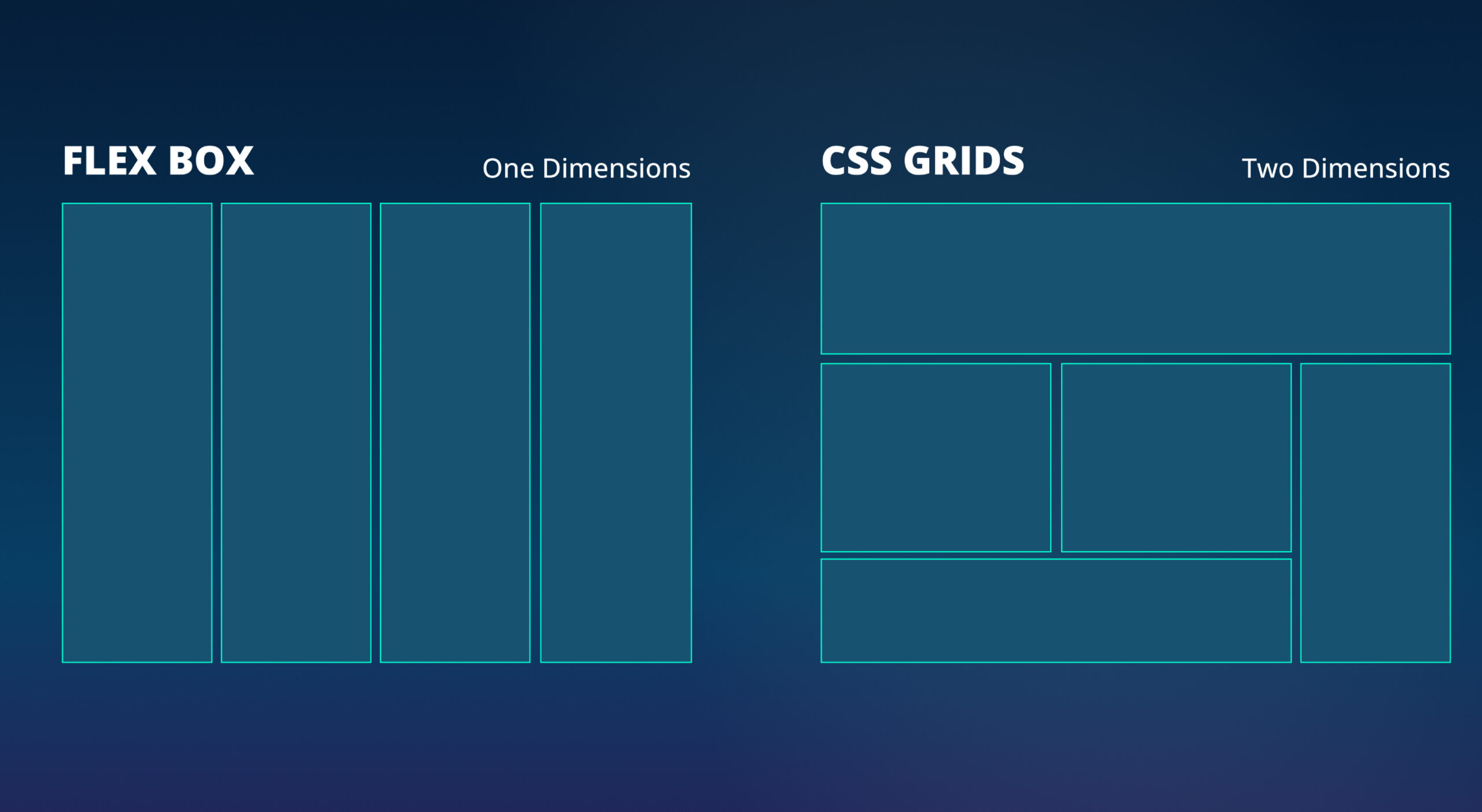
Improved Grid System: The grid system in Bootstrap 5 lays out and aligns data using a sequence of containers, rows, and columns. It is fully responsive and developed with Flexbox. The grid system in Bootstrap supports six responsive breakpoints. SASS variables, maps, and mixins power the grid. Gutters are also responsive and customizable. Columns are incredibly flexible. Rows are wrappers for columns. Containers center and horizontally pad your content.
Better Documentation: Documentation for Bootstrap 5 has been updated with more information and enhanced customization instructions.
Enhanced form Controls: In Bootstrap 5, all custom form controls have a uniform look and feel, including radio buttons, checkboxes, files, and ranges.
Adds Utilities API: In Bootstrap 5, a new SASS language and syntax have been introduced, qualifying users to build new utilities and customize the defaults.
New Bootstrap Icon Library: With almost 1,300 icons, Bootstrap now has its own open-source SVG icon collection. Although it was developed mainly for the framework’s components, you can use it on any project.
What’s replaced, and What’s not there?
The latest update has made many changes to the utility classes and components. For instance, badge color classes have been replaced with color utility classes like .bg-primary. The .badge-pill badge class has been replaced with the .rounded-pill class for a pill style on a badge. Display utility classes like .d-block have replaced the .btn-block button class, and the jumbotron component has been removed in favor of utility classes.
Popper’s configuration has been utilized instead of the flip option for dropdown components. Media components have been dropped as the same results can be attained using utility classes. Least used classes like .pre-scrollable and .text-justify have been removed. And lastly, support for Internet Explorer has been completely dropped.
Bootstrap 5 vs Bootstrap 4
|
BASIS OF |
BOOTSTRAP 4 |
BOOTSTRAP 5 |
| Color | It has limited colors. | Color palette improved with additional shades to choose from. |
| Grid System | It has 5 tier xs, sm, md, lg, xl. | It has 6 tier xs, sm, md, lg, xl, xxl. |
| Internet Explorer | Bootstrap 4 is compatible with both Internet Explorer 10 and 11. | Bootstrap 5 is not compatible with Internet Explorer 10 and 11. |
| Jquery | The website includes jQuery and all of its related plugins. | The Jquery library has been replaced with vanilla JS along with several functional plugins. |
| Utilities API | It is not possible to alter utilities in Bootstrap 4. | Possible to modify and also create our utility |
| Form elements | Radio buttons and checkboxes have different appearances across different OS and browsers. The form utilizes the default features provided by the browser. | Forms look the same on different systems and browsers. You can customize them and add controls. |
| Gutter | Use .gutter with font size in pixels. |
Use .g* with a font size measured in root-em |
| Vertical Classes | Columns can be placed relative. | Columns cannot be placed relative. |
| Jumbotron | It supports jumbotron | It doesn’t support jumbotron |
| Bootstrap Icons | It doesn’t have native SVG icons; You need to use font-awesome for icons. | Bootstrap 5 has its own set of SVG icons. |
| Card deck | The card deck is used to create a set of cards with the same width and height. | The card deck class has been removed from this version. |
| Navbar | In this version, the dropdown-menu-dark class has a default white dropdown due to the inline-block property. | The inline-block property is removed, resulting in a black dropdown menu as default for the dropdown-menu-dark class. |
| Flexbox grid | Vertical designs, columns, and rows can be quickly executed. The “justify-center-content” classes can be utilized directly to align content as needed. | The advanced grid system is made available, which also eliminates the need for columns to have relative positions. |
| Static Site Generator | Here, Jekyll software is utilized | Here, Hugo software is utilized as it is a fast static site generator. |
| Offcanvas Component | The Offcanvas Component is not supported. | It supports the Offcanvas Component. |
| RTL Support | The RTL (Right to Left) switching feature is not available in this version. | RTL(Right to Left) text switching across layouts, components, and utilities enabled. |
What are Bootstrap Templates?
Bootstrap templates are a foundation for a website’s layout. These templates offer a great starting point with all the styles you need, provided by the reliable Bootstrap framework. Minimal custom CSS is used primarily for laying out content, and there are limited options for design or styling changes, which avoids a mess. On the other hand, Bootstrap themes come pre-styled, so you don’t need to stress over making many design decisions. With a theme, you need to update the content (text, images, etc.), and you’re ready to publish your website.
Why Should You Use Bootstrap Templates?
1. Preventing repetitions among multiple projects is crucial to avoid wasting time and resources.
2. Responsive design is essential in today’s digital landscape, where users access websites and applications on a variety of devices especially on smartphones.
3. Maintaining consistency among projects when using multiple developer teams
4. Quick prototyping is a valuable tool for testing and refining design concepts before fully committing to development.
5. Cross-browser compatibility is essential for ensuring a website or application works correctly on all major browsers.
Popular Bootstrap Templates
Bootstrap templates are the best for instant use. There are no other alternatives if you need a website or admin template for a web application or website that has to be responsive, readily customizable, SEO friendly, and budget-friendly, as well as time-saving. So, let’s see a few categories and a couple of examples in each category.
1. Bootstrap Admin and Dashboard Templates
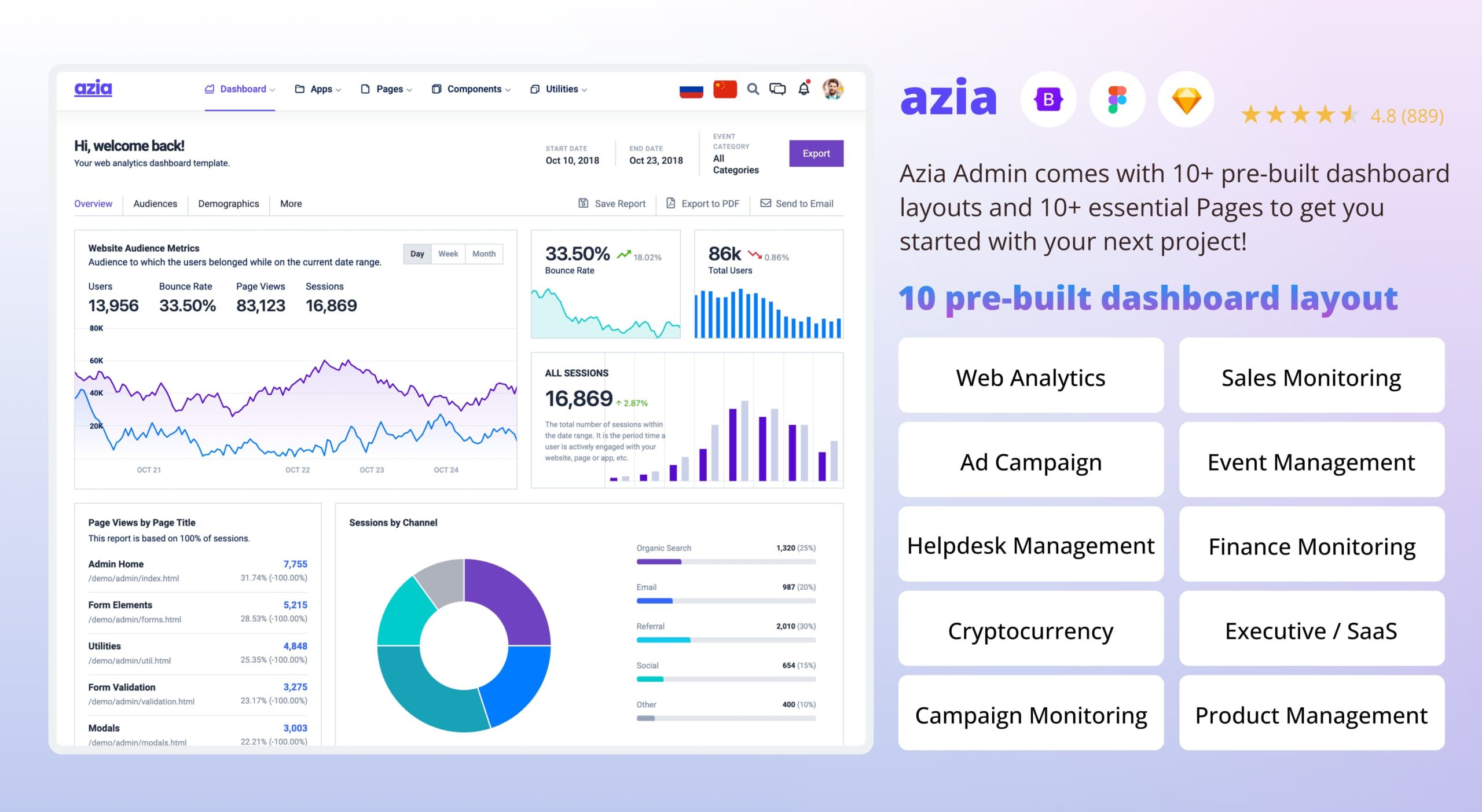
Azia Admin
This is a premium Bootstrap 5 admin template featuring components that are built to fit perfectly with each other. Azia offers a clean interface that easily adapts to fit your concept and branding. It has several essential utility classes to help minimize CSS load and modify CSS components immediately. This ensures that your dashboard is lightweight and functions like a feather.
Azia Admin provides a variety of options for dashboard layouts. With 10 pre-designed layouts, you can find a design that suits your needs quickly. Whether you are looking for a simple and clean layout or a more complex and data-driven design, Azia Admin has you covered. With Azia Admin, creating a customized and effective dashboard may be easier than you think.
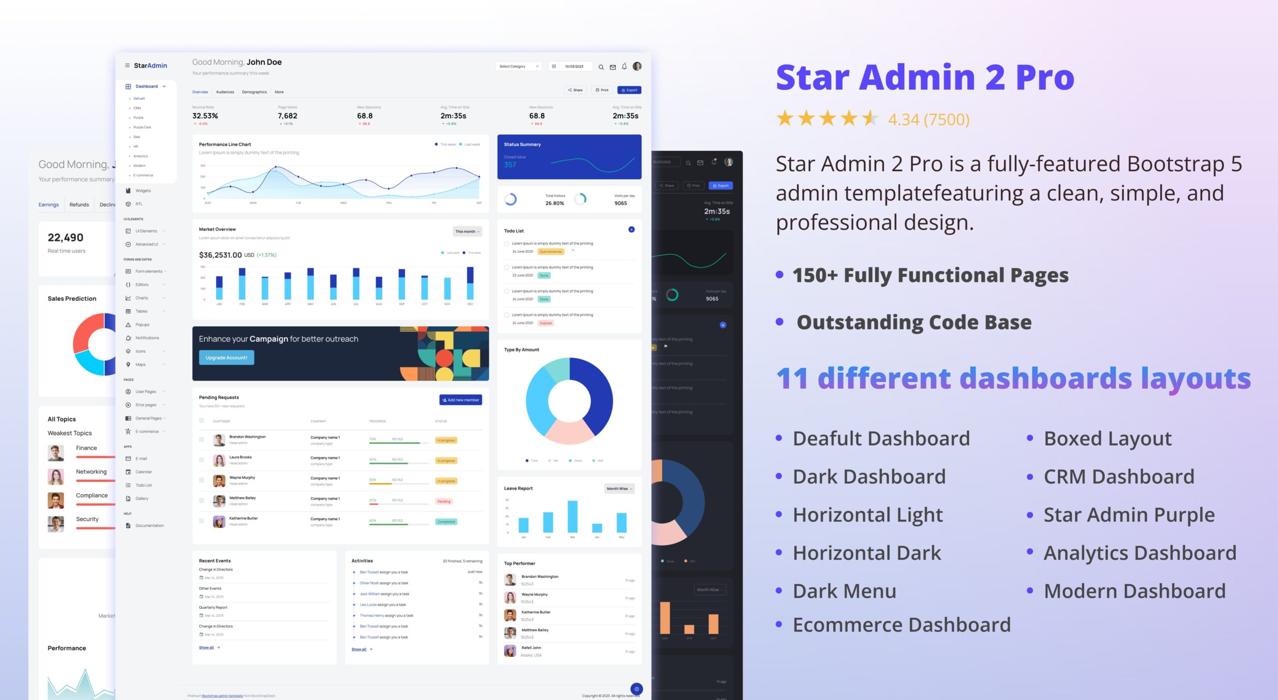
Star Admin 2 Pro
A premium Bootstrap 5 admin template designed on top of the most comprehensive Bootstrap 5 framework. Star Admin 2 Pro offers many useful components for developers. You can choose from 11 different dashboards that will help you find the best layout suitable for your concept of the web app or website. With Star Admin 2 Pro, you will benefit from detailed documentation files, ultra-adaptive and responsive pages, zeroJS, Gulp and Webpack build tools, and other scalable assets.
There are a number of free dashboard templates from Bootstrapdash which are feature-rich and may be more than enough for your projects.
2. Bootstrap E-commerce Templates
Flone
Now, if you’re looking to launch an eCommerce store, Flone is a mega shop HTML template for creating an eCommerce website for any business. With this template, you can sell any number of products and categories, for instance, ready-made clothing, fashion products for men, women, and kids, shoes, watches, sunglasses, cosmetics, gadgets, electronics, furniture, and much more.
Erina
Erina is another option for e-commerce businesses to start with. This Bootstrap e-commerce template claims various unique features, and you can customize details to suit your branding. You can showcase your featured products and draw customers with high-quality images of your products. Also, create a well-organized product detail section. You have everything you need to make a well-sorted and uncomplicated product page for your customers.
3. Bootstrap Landing Page Templates
Landing pages are the best way to boost sales or get leads. Landing pages are a great marketing strategy in 2023 and the coming years.
Agico
Agico is a latest landing page template in Bootstrap version 4.5.0 that follows all the updated web trends and IT regulations. The eye-catching appearance and responsive layout will hook your audience on any device. It’s compatible with all major browsers and has a user-friendly interface with fast loading speed. The template comprises hover effects, pricing tables, video sections, and a blog section. You can personalize the appearance to stand out from your competitors.
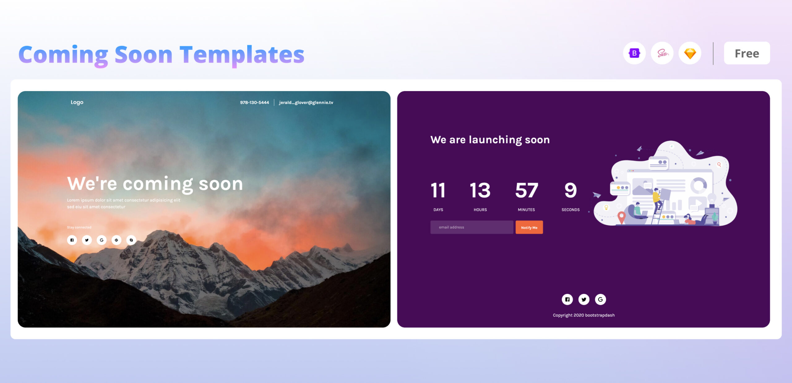
Bootstrapdash Coming Soon Page
Bootstrapdash’s Coming Soon page is a free coming soon template that features two layouts. It includes simple, attractive background images, social media icons, and beautiful designs. The design has everything you need for a coming soon landing page and nothing extra to distract your customers away from what you have to convey.
4. Bootstrap Portfolio and Resume Templates
iPortfolio
When it comes to creating a portfolio, it’s important to keep it simple and easy to understand for potential clients or employers. Instead of starting from scratch, consider using Bootstrap as your framework.
For a minimalist and stylish portfolio design, iPortfolio is an excellent option. This HTML template is perfect for showcasing your portfolio as well as displaying products, clients, and services. It’s fully responsive and built using the latest technologies, including Bootstrap, HTML5, CSS3, jQuery, and SASS. The single-page design also includes animation and smooth scroll effects, making it both SEO-optimized and cross-browser-compatible. Plus, the design is easily customizable and the code is clean.
MyResume
Another similar template for resumes is MyResume. MyResume is a customizable Bootstrap template for digital professionals, perfect for showcasing work online. It features a clean design, the latest Bootstrap version, SASS/SCSS source files, and comes with full customization options. It is fully responsive and well-optimized for all devices, especially mobiles.
5. Bootstrap Blog and News Templates
Bootnews
News and blog pages look for options where they can keep the uniformity. Bootnews is a Bootstrap news magazine and blog template in Bootstrap 5. With this, you can create an excellent news magazine and blog website. The template is available in HTML and WordPress versions.
Katen
Another Bootstrap news and blog template is Katen. This is a responsive modern HTML template for magazines, personal blogs, and news. It is customizable, with a unique web design that will help you modify the page outlook to your brand concept. The template includes more than 10 pre-built pages built with HTML5, SASS and Bootstrap5.
How to customize bootstrap templates? Step by Step Instructions
Bootstrap templates help you save time and effort, but sometimes, it is a good idea to add some of your own original arrangements. To assist with this, we’ve included a brief step-by-step guide to customize a Bootstrap template.
Step 1:
In the root folder of the project, create a custom stylesheet. To open the code inspector, press F12 or right-click anywhere on the page.
Step 2:
Select the element you want to edit by clicking the arrow in the control panel of the code inspector, located at the bottom left of your page.
Step 3:
To access your code inspector panel, make sure you have selected the ‘inspector’ option in the left panel. On the right side, you will see a list of CSS properties matching the selectors. Simply copy and paste these selectors into your customstylesheet.css file.
Step 4:
If you want to customize Bootstrap’s CSS, simply include your preferred property values in this section.
Step 5:
Link your custom stylesheet.css to the page after linking the bootstrap custom CSS file. Otherwise, the override attribute of your custom CSS may not work.
Wrapping Up
Bootstrap streamlines web development by offering a toolkit to overcome challenges and make visually appealing, responsive websites. Its responsive grid system, UI components, and mobile-first approach help developers deliver seamless user experiences across devices and browsers. Bootstrap’s customization options, adaptability, and community support make it valuable for seasoned developers and newcomers. By addressing pain points, Bootstrap leads to more efficient and successful web projects, making it a reliable partner for any type of web development.
