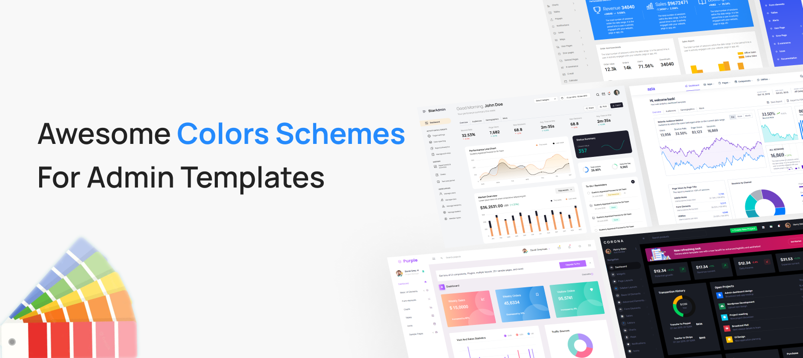
The importance of color schemes cannot be overstated when it comes to websites. Colors unconsciously influence our perception in many more ways than we think, and even though we say that one shouldn’t judge anything by its appearance, we nevertheless do the same.
It is the impression that the best color schemes for websites have on us that makes us stick to a particular site and persuades us to make purchases.
Appearance is crucial for creating an instant impression, but the real value of an admin template or admin dashboard can only be determined after a period of use. The best color schemes for HTML admin website templates are those that are visually captivating yet easy on the eyes.
The world of colors is vast, making it challenging to choose the perfect color palette for an admin template or admin dashboard color palette. Skilled designers with an eye for detail are necessary to navigate the permutations and combinations of colors that create hundreds of options.
However, it’s worth noting that the best admin templates and dashboard color palettes used by top brands and social media sites typically avoid extravagant and overwhelming color schemes.
It is not because they are obsessed with minimal designs, but because they pay attention to Color psychology. The spirit and the mood Color combinations induce in users define the success of your choice. Here, let us look at some of the beautiful Color schemes for admin templates that have been designed keeping both aesthetics and Color psychology in mind.
Star Admin 2 Pro – Graceful Merger of Brown and Athens Grey
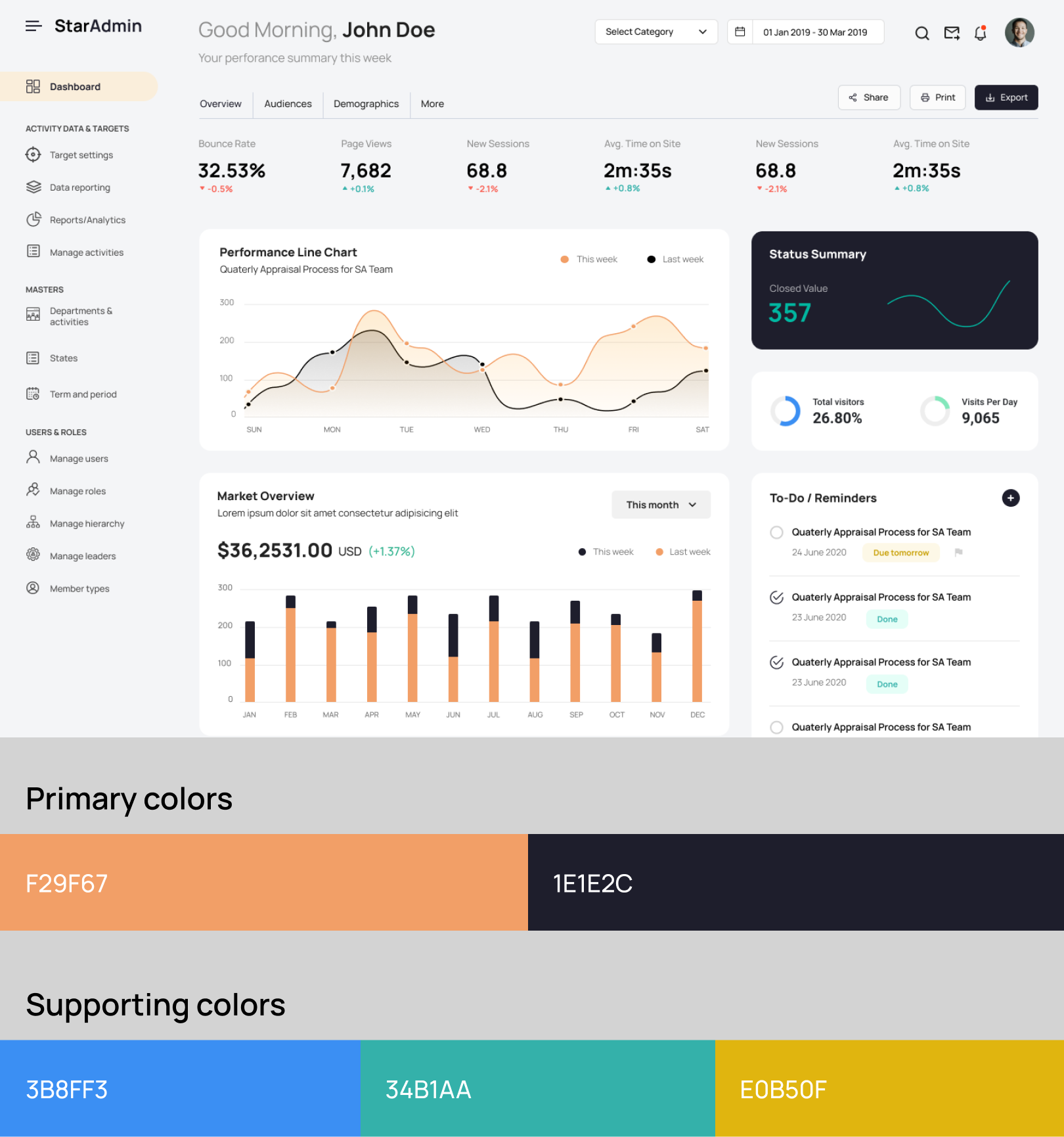
The color scheme of brown and Athens grey is an elegant and beautiful combination that creates a sophisticated look for dashboard templates. By adding tints of pink, blue, and red for infographics, the color palette becomes even more visually pleasing.
This balanced and classy color scheme is prominently featured in the Star Admin Pro admin template, making it an excellent choice for those looking for elegant and beautiful color schemes for their dashboard designs.
Skydash– Minimal and Universal Shades of Blue
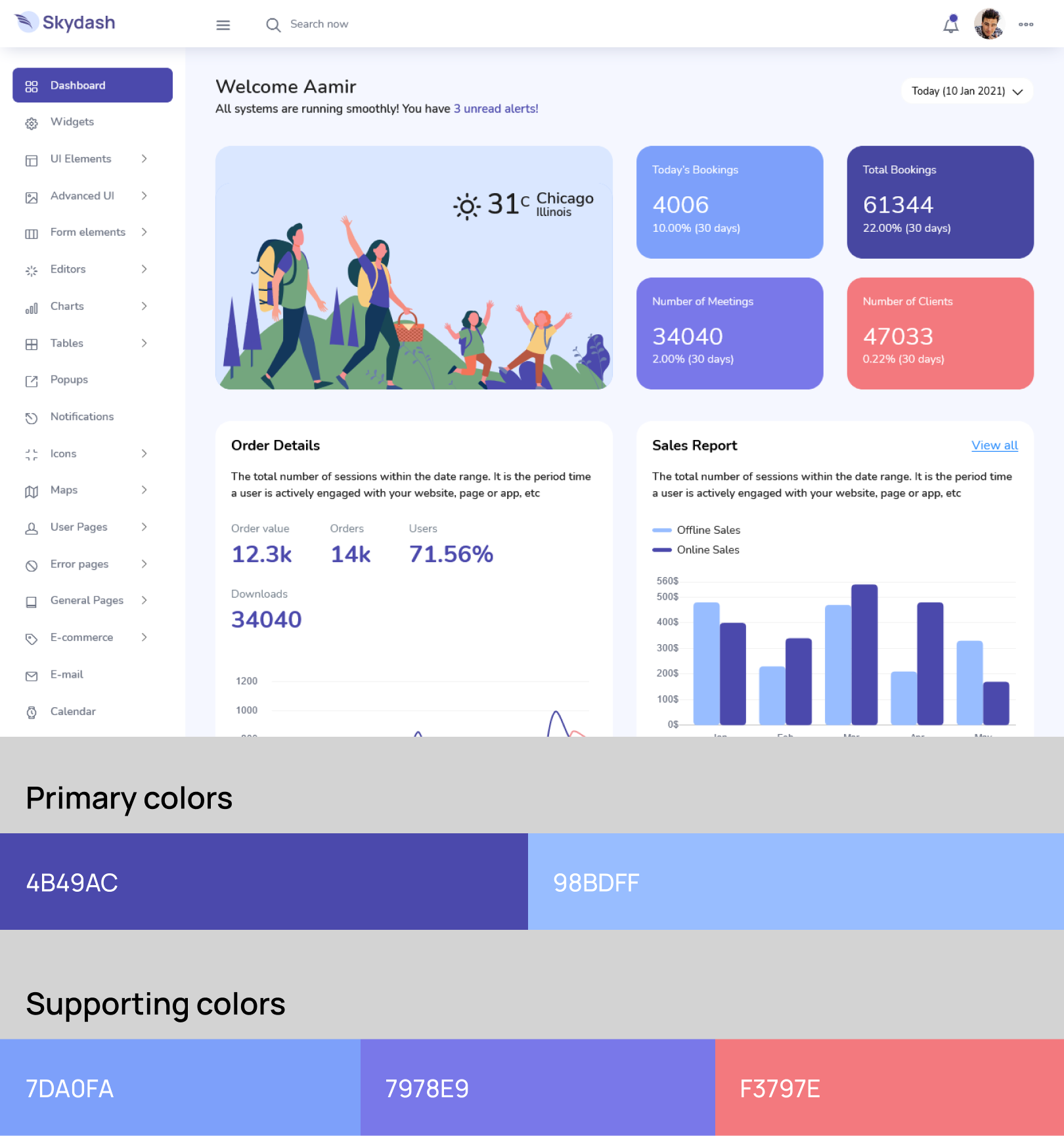
The Skydash admin template showcases one of the best color combinations for websites, featuring a mix of violet-blue, sail blue, and tonys pink on a clean white background. The shades of blue evoke an inspiring feel, while the tonys pink adds a lively and energetic mood.
The minimal use of the white background keeps the color scheme balanced and elegant. Check out the preview of the Skydash admin template to see this beautiful color combination in action.
Azia- Fuschian and Aquamarine Blue against White Background
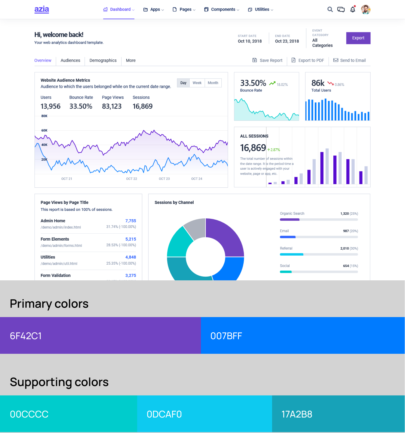
The Azia admin template is a great example of a good color scheme for websites that use a minimal color palette. The combination of fuschian and aquamarine blue against a dominant white theme gives a simple yet serious appearance.
The two shades of blue work together to evoke emotions of clarity and serenity, making it perfect for admin templates with infographics such as charts and graphs. The Azia admin template uses this modern color scheme brilliantly, demonstrating how similar yet discernible colors can blend in rather than stand out with the whole theme.
Purple- The Pleasant Trio of Contrasting Hues
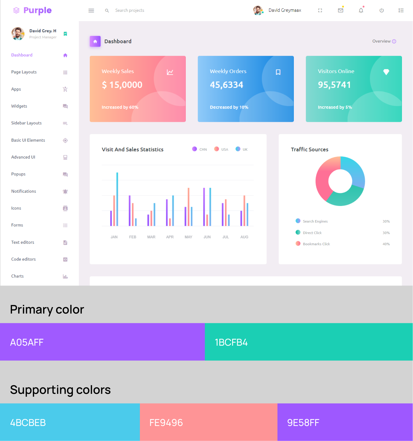
The Purple admin template is a prime example of a well-crafted color theme suitable for dashboard designs. By utilizing contrasting colors such as turquoise green, cornflower lilac, and malibu blue, this template creates a colorful and pleasant atmosphere.
The use of purple in the name and graphs also elevates the template’s engaging mood, resulting in a brilliant combination of colors. Overall, the Purple admin template serves as an excellent reference for designing captivating dashboard color schemes.
Corona – Elegant and Powerful Dark Theme
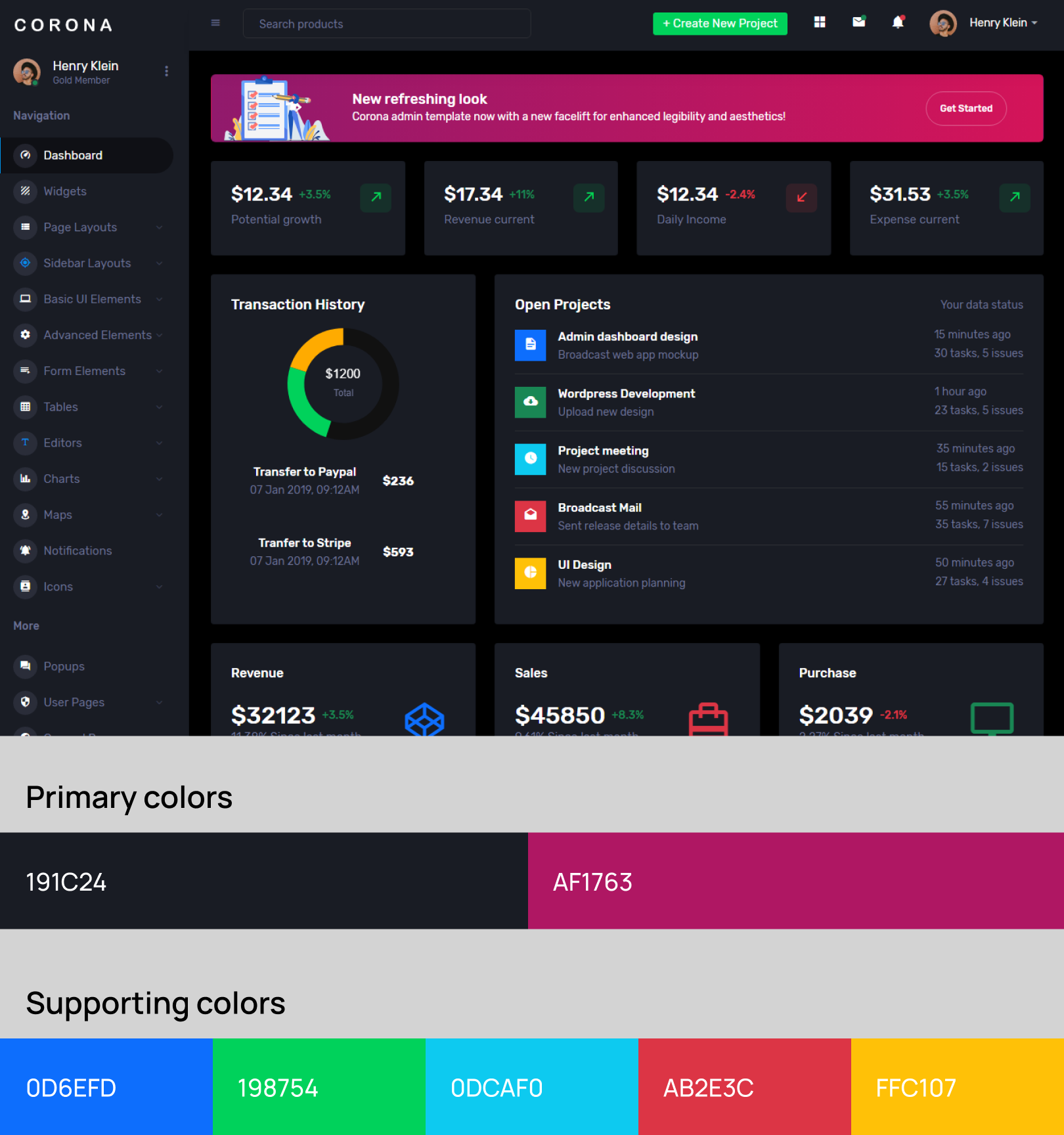
Admin templates with shades of black have a powerful and elegant vibe to them. Choosing a color combination in a dominant dark theme is not as easy as it may look. Dark themes are not appropriate for admin templates that require a lot of Colors for icons and infographics. You have to be extra careful while using a dark Color scheme for your admin template.
Corona admin template has the perfect dark theme with a dominant ebony clay Color. This template uses malachite green, selective yellow, and mandy for the small icons it has. It is noteworthy that the incorporation of these seemingly joyful shades does not affect the authoritative mood of the ebony clay.
See the live preview of the admin dashboard template for the employment of colors sticking to Color psychology.
JustDo– Light and Dark Themes with Dodger Blue 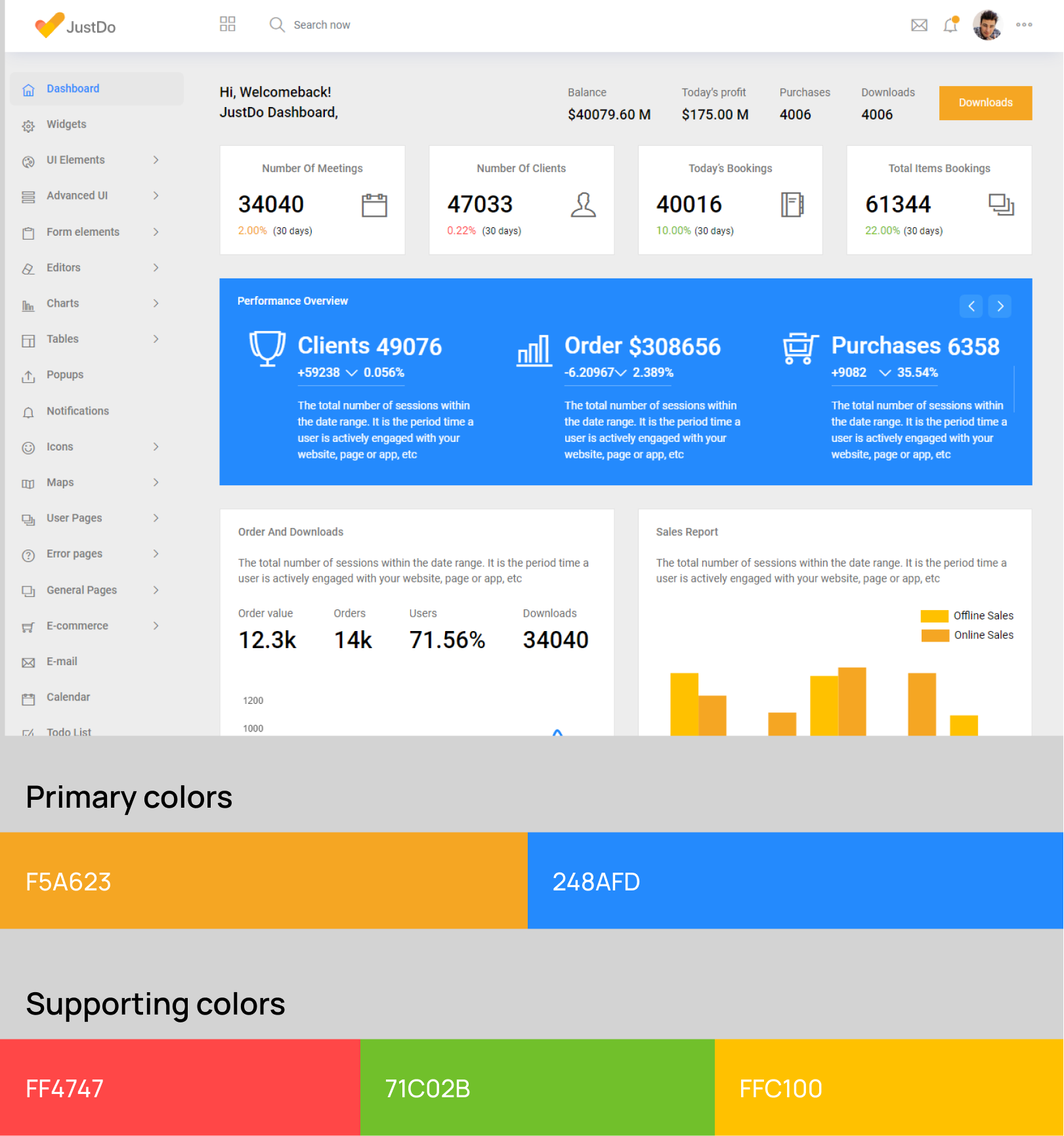
Dodger blue is a versatile color that works well for both light and dark color schemes, including popular bootstrap color themes. This bright and lively shade of blue pairs perfectly with white and black shades. When used with a white background, it creates a cheerful mood, and when paired with black, it looks elegant and stylish.
The JustDo dashboard template offers themes with both of these dodger blue combinations, making it a great choice for those looking for a modern and flexible color scheme.
Plus Admin – Modern and Dynamic
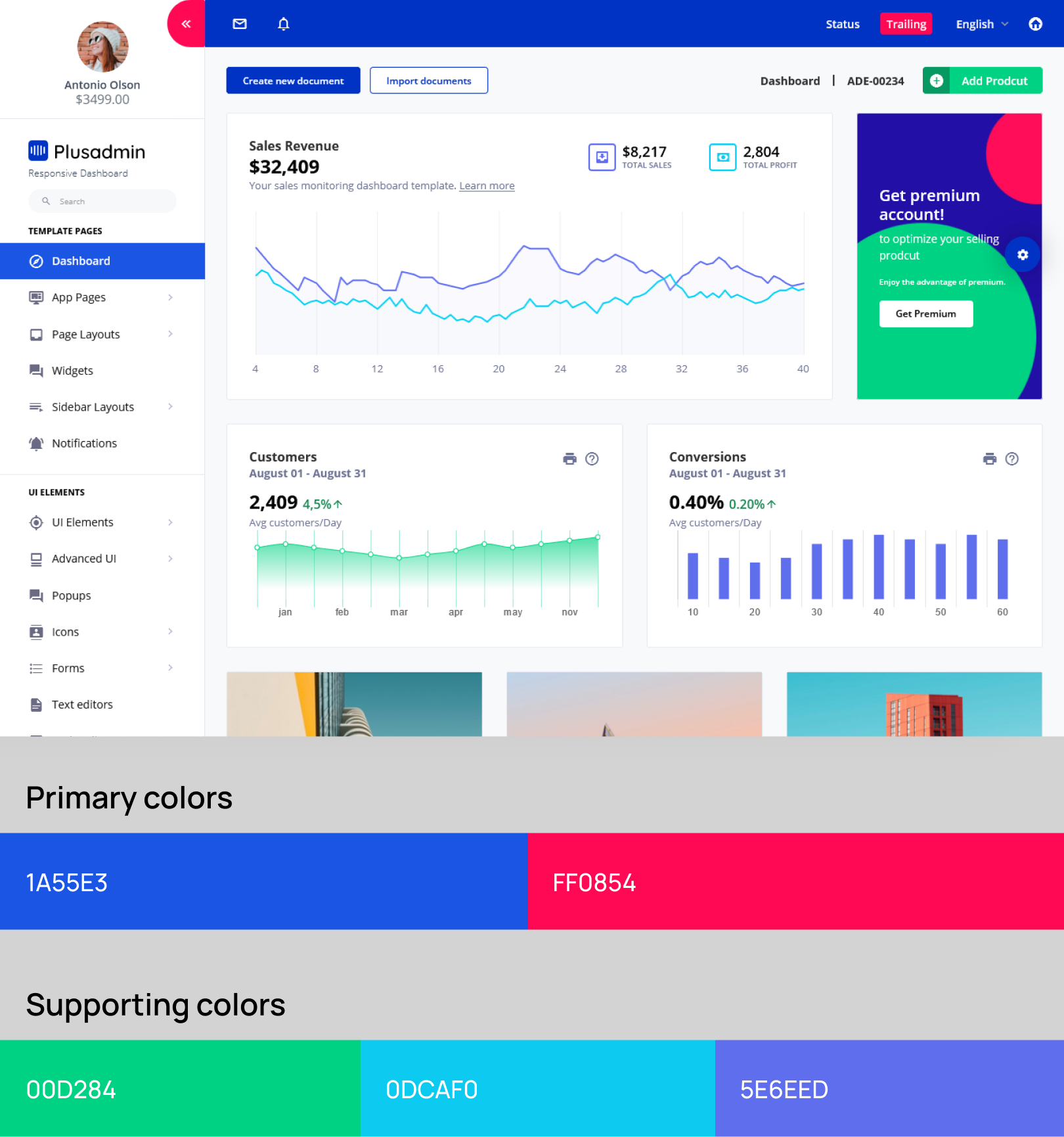
The statement emphasizes the use of modern website color schemes, specifically the use of unreserved combinations of bright colors, which create an active and dynamic design. When used appropriately, these color schemes can induce a zestful mood and encourage users to take action. The Plus admin template is cited as an example of a beautifully designed high-quality template that embodies this approach.
The color palette used in the Plus admin template consists of Caribbean green, Governor Bay, and Radical Red against a white background, which creates a cheerful and inviting color scheme. The statement concludes by stating that this color palette is one of the best dashboard templates in 2022, highlighting the importance of staying up-to-date with modern color schemes in design.
Breeze– Vibrant and Serious Combos
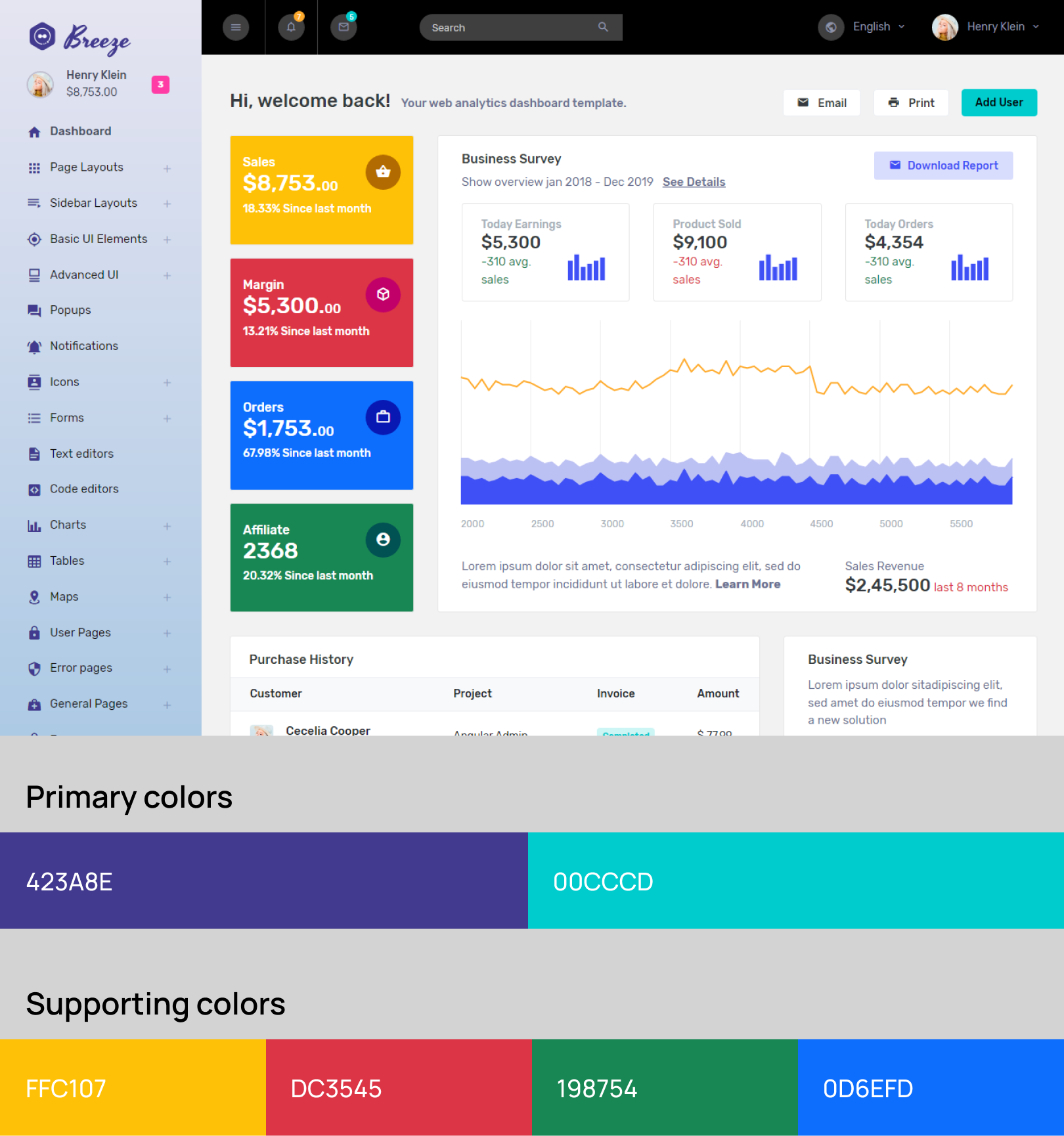
The use of Colors in creating an attractive dashboard template. It highlights the importance of finding a balance between vibrancy and seriousness and suggests that a dominant background with shades of white and grey can achieve this.
The addition of shades of pink, yellow, purple, and green for infographics can further enhance the design. The Breeze admin template is given as an example of a dashboard template with a smart amalgam of Colors.
SmartAdmin – Calming Lavender Grey
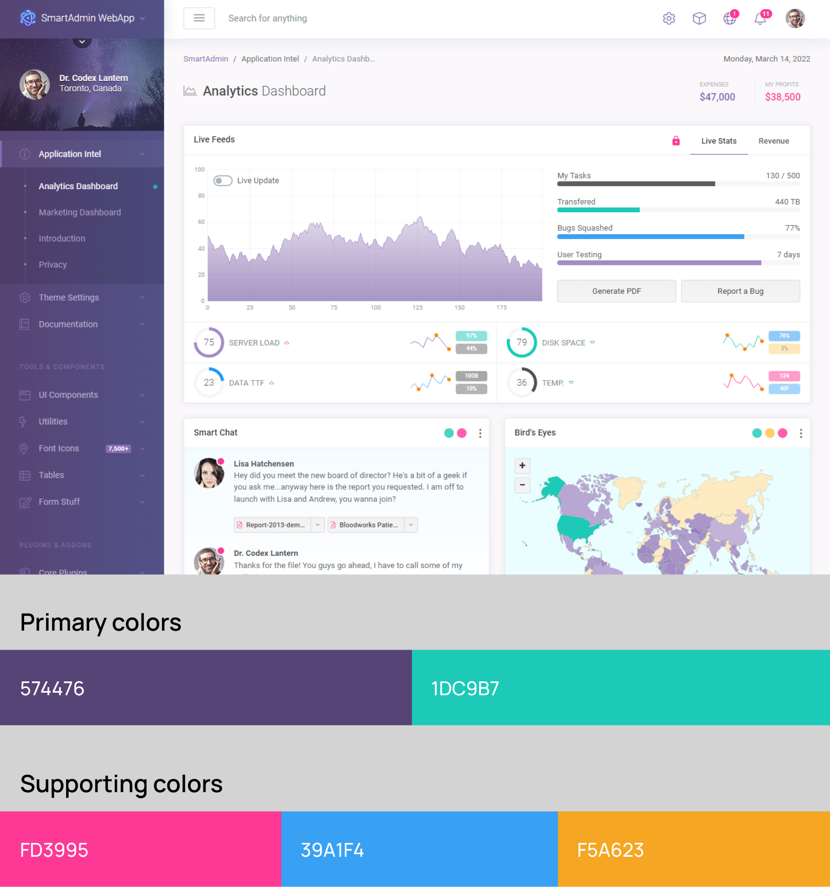
Lavender grey is a Color that gives stunning Color schemes when paired with white or dark Colors. This minimal combination at once maintains the introspective mood for the infographics and boosts the total aesthetics of the admin template.
Smart Admin admin template uses this Color palette with both light and dark themes. The premium look of this highly responsive template owes to its coupling of lavender grey with shades of white and black.
Nifty– The Tranquillity of Chambray Blue and White
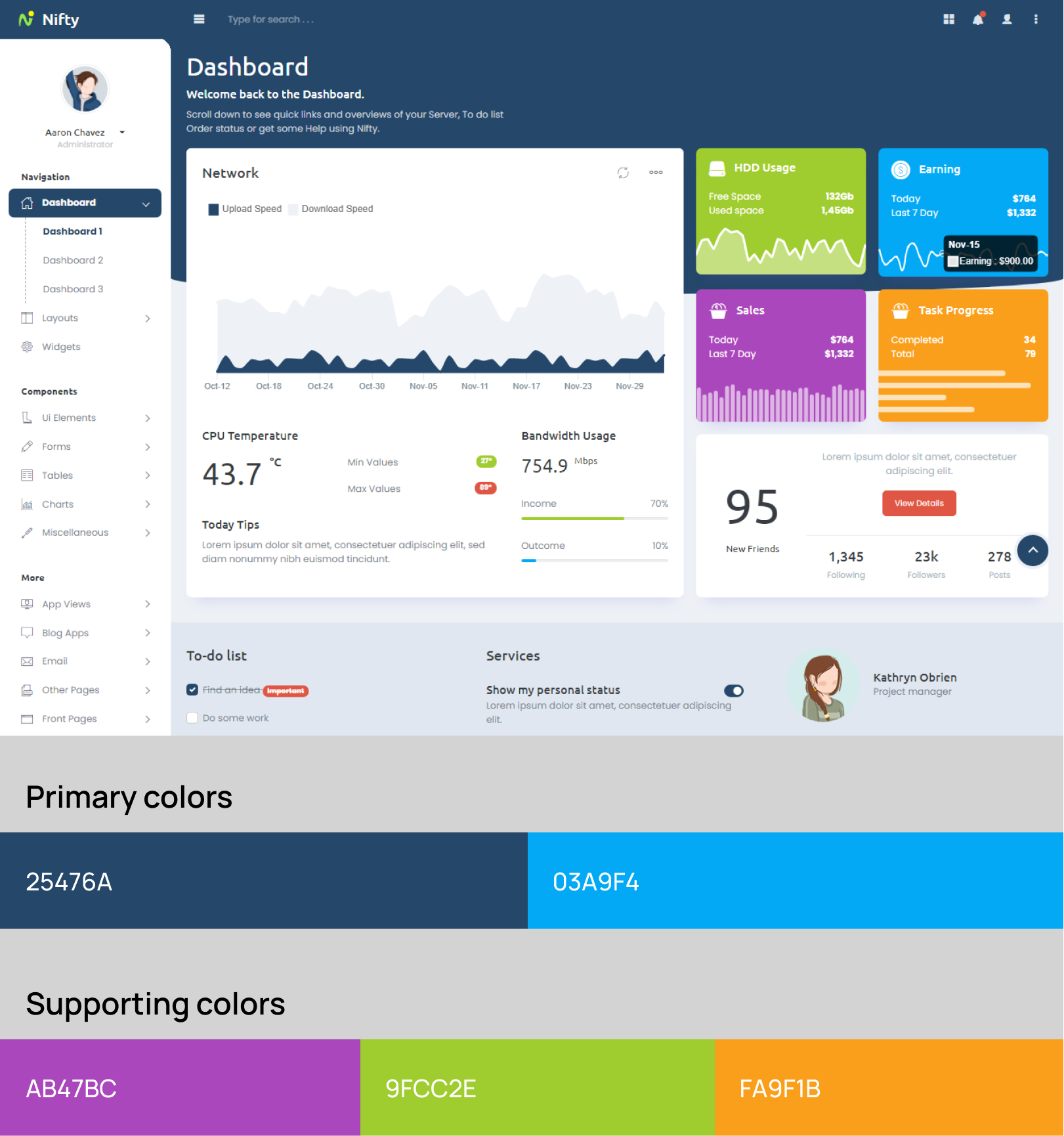
Chambray blue, when paired with white confers an inviting tone to the admin template. The pair creates a warm and authentic feel to the UI. As can be seen in the Nifty- Bootstrap 5 Admin Template, the visual is attractive and evokes tranquillity.
The template also uses shades of green, blue, and yellow Colors for infographics, which altogether adds to the serene appearance.
Few Colorful Thoughts
When it comes to selecting the best color schemes for websites, it’s important to balance creativity with practicality. A color scheme that may look great on one website may not necessarily work well on another.
The goal is to choose a color scheme that aligns with the website’s purpose, content, and target audience. Warm and earthy colors like brown and orange can evoke feelings of comfort and stability, while bright and bold colors like yellow and red can create a sense of urgency and excitement.
It’s also important to consider the use of contrast and balance within the color scheme. A well-balanced color scheme can create a harmonious and aesthetically pleasing design.